Schedule a Demo
In my work with startup founders and tech leaders, I've seen Flexbox consistently reign supreme when it comes to crafting dynamic, user-friendly layouts. Flexbox isn’t just a tool; it's a philosophy of design flexibility that aligns perfectly with the rapid iteration model so crucial to scaling businesses. Its ability to adapt content across various screen sizes without rigid positioning lets your MVP evolve seamlessly as your user base grows.
By setting a container to display: flex;, you can effortlessly align and distribute space among items in the container. Even better, using flex-wrap: wrap; can ensure that your website remains functional on any device, offering a smooth experience from smartphones to desktops. As your website expands with new features or content, Flexbox's intuitive nature simplifies maintenance and updates, an essential advantage for founders needing to iterate quickly.
While Flexbox shines for simpler structures, CSS Grid steps in where more complexity is required. It’s like having a Swiss Army Knife for your layout needs. CSS Grid is incredibly powerful for creating adaptable structures for enterprise-level software solutions, enabling you to design intricate, multi-column designs that can adjust dynamically to user screens.
Its two-dimensional control over columns and rows lets you create truly responsive designs without the need for additional breakpoints. By using grid-template-columns and grid-template-rows, you can craft a layout that not only responds well but looks stunning on any device. For startups with ambitious plans for their web presence, CSS Grid offers a scalable solution that can grow alongside your company.
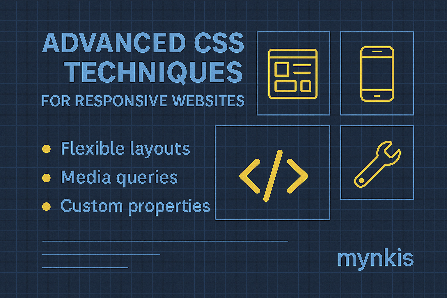
Media Queries remain a staple in the toolkit of responsive design. These allow you to tailor your website's appearance and behavior to different devices, making sure your startup’s MVP looks and functions optimally no matter where it’s viewed.
In my experience, effectively leveraging Media Queries can drastically enhance user satisfaction and engagement. Consider setting breakpoints not just based on device widths but on UX considerations—like readability or interaction comfort zones. With syntax like @media (max-width: 600px) { ... }, you can adjust elements’ styles to enhance usability, transforming your site from merely functional to genuinely user-centric.
Relative units such as rem, em, and % play a critical role in maintaining consistency and scalability. I've seen startups struggle with fixed units that don’t adjust well across different devices, leading to cluttered or sparse interfaces depending on the screen.
By employing relative units, you establish a flexible sizing system. A great example is using rem for font sizes, allowing text to scale in response to user settings, thereby improving accessibility and responsiveness. This approach aligns with the latest web accessibility guidelines and helps ensure that as your startup scales, your website's design remains cohesive and user-friendly.
CSS Variables—often called custom properties—are a powerhouse for maintaining efficiency as your project scales. In a tech startup environment where rapid changes are the norm, CSS Variables can save countless hours on theme modifications and global styling updates.
Consider a case where a color palette change is needed across an entire website. With CSS Variables, updating a single line like --primary-color: #3498db; instantly refreshes all related elements, preserving design coherence as you experiment with different looks or as your branding evolves.
In the multifaceted world of web development, ensuring your responsive design works across all platforms is non-negotiable. Vendor prefixes can feel cumbersome, but they're crucial for tapping into cutting-edge CSS features on different browsers. -webkit-, -moz-, and other prefixes ensure your startup's website performs reliably everywhere.
While some might shy away from the extra code, tools like Autoprefixer can automate this process, freeing you to focus on more strategic elements of your web development. This consideration is essential for startups aiming to maximize their market reach without the hassle of manual browser testing.
The mobile-first approach isn’t just a trend; it’s a foundational principle that underscores the responsive design philosophy central to building scalable and future-proof MVP websites. Starting with the smallest screen forces you to prioritize content and functionality from the outset, ensuring your digital product is essential at every step.
This method resonates deeply with the lean startup methodology, where minimizing unnecessary features until proven valuable can significantly reduce development costs and time to market. Starting small allows for gradual enhancements tailored to actual user needs, ensuring the longevity and adaptability of your tech infrastructure.
Responsive design isn’t just about text and layout; it’s also about handling images responsibly. As startups focus on expanding their user base, load times become critical. I’ve seen promising startups falter due to slow-loading, image-heavy pages.
Strategies like using srcset and sizes attributes in the img tag help ensure images load appropriately for the user’s device, improving both speed and user experience. Furthermore, modern formats like WebP offer high-quality visuals at smaller file sizes, aiding in the overall performance optimization—a necessity for an engaging MVP.
While performance is key, aesthetics shouldn't be ignored, especially in a California design agency’s ethos where form meets function. CSS Animations and Transitions can add that extra layer of polish to your startup's website, making interactions feel more refined and sophisticated.
However, it’s essential to strike a balance. Excessive use of animations can detract from user experience on lower-end devices. When applied thoughtfully—as subtle cues or interactive feedback—they enhance engagement without compromising performance, aligning perfectly with an MVP that needs to be both appealing and functional.
In my years working in software development, I’ve come to understand that accessibility isn’t an afterthought—it’s integral to creating successful digital products. Foundational CSS techniques like proper use of alt text for images, high contrast ratios, and semantic HTML elements are pivotal to making your responsive website inclusive.
Moreover, advancements like the :focus-visible pseudo-class have made it easier to design with keyboard navigation in mind, which is not just beneficial for accessibility but can also enhance user interaction for all users. Incorporating these practices ensures that as your startup's tech infrastructure grows, it remains accessible and welcoming to all, fostering a broader and more loyal user base.
The journey of responsive web development is never done; it’s a cycle of design, build, test, and iterate. For founders navigating the complexities of scaling software, continuous integration and testing are lifelines.
By integrating tools like BrowserStack into your development process, you can ensure that every update to your MVP retains its responsiveness across devices. Testing in real-world conditions reveals insights that simulations may miss, guiding your tech strategy to provide not just a functional but an optimal user experience at scale.