Schedule a Demo
As the digital realm continues to evolve, businesses are constantly on the lookout for innovative ways to make their mark online. Asymmetrical layouts represent a bold shift from traditional design paradigms, offering unique aesthetics and engaging user experiences that can set a website apart. In my work with various owners, I've seen how embracing an asymmetrical approach not only captures attention but can enhance SEO and organic growth by crafting a distinct online identity.
For entrepreneurs, breaking free from the rigid constraints of a symmetrical grid can be a thrilling venture. The asymmetry in design creates dynamic tension that naturally draws the eye across the page, encouraging visitors to explore more deeply. This increased engagement often leads to better conversion rates, an essential metric for any business looking to leverage its online presence effectively.
Asymmetry triggers cognitive processing different from that of symmetrical designs. The human brain finds interest in complexity and novelty, and an asymmetrical layout often exploits this by creating a narrative across the screen. Studies from design experts like Nielsen Norman Group show that such layouts can increase user satisfaction if designed with clarity and user-focused navigation in mind.
The use of asymmetrical elements doesn't merely stop at visual appeal; it can also guide users subtly through the website. For instance, large, bold images placed asymmetrically can pull viewers toward key calls to action or highlight products in a way that symmetric designs might not. It's this strategic placement of visual weight that can transform a website from just another URL into a memorable brand experience.
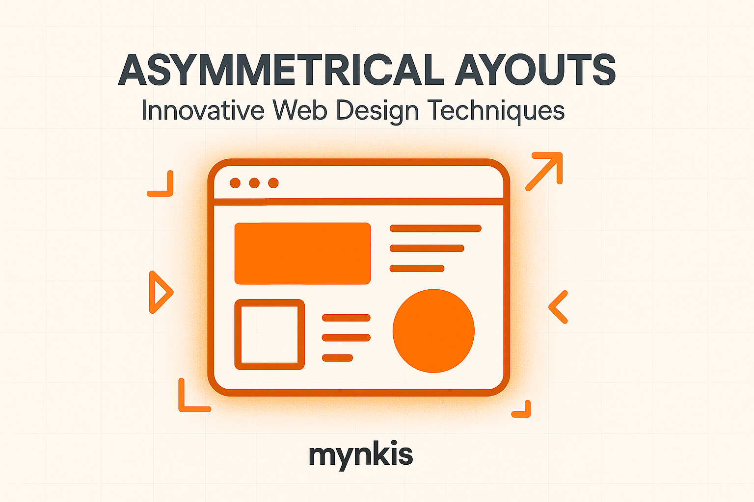
Embracing an asymmetrical layout begins with the understanding that balance does not necessitate symmetry. A successful asymmetric design creates visual harmony through the thoughtful distribution of elements, like text, images, and empty space. In practice, this might mean having a larger image on one side of the page balanced by smaller, lighter text on the other. This approach can be powerful in crafting a memorable and professional-looking site on a budget.
The versatility of asymmetrical design also lends itself well to responsive web design, crucial for businesses aiming to reach their audience on various devices. By flexibly adjusting elements according to screen size, an asymmetrical layout can maintain its impact and effectiveness across desktops, tablets, and smartphones, providing an optimized experience for every user.
From an SEO standpoint, an engaging, user-friendly design is paramount. Google's algorithm places significant emphasis on user engagement, which can be boosted through the creative implementation of an asymmetrical layout. Pages that captivate users, encouraging them to stay longer and explore more, can benefit from improved SEO rankings.
Moreover, the use of varied text sizes and strategically placed images within an asymmetrical framework can facilitate a content hierarchy that search engines recognize and reward. While creativity is key, adhering to SEO best practices, such as optimizing alt text for images and ensuring fast load times, remains vital even in unconventional design formats.
Real-world examples illustrate the impact of asymmetrical layouts on web design and business growth. A tech startup I collaborated with utilized an asymmetrical homepage layout featuring a large product image juxtaposed with concise, feature-highlighting text blocks. The result was a stunning increase in user engagement metrics, with time on site and bounce rates improving significantly within weeks of launch.
Similarly, a local bakery owner embraced an asymmetric design for their e-commerce platform. The page layout used a powerful blend of hero images and hand-crafted product visuals to tell a story, which translated into higher customer retention and increased online orders—demonstrating the practical power of such design techniques on an affordable scale.
While the benefits of asymmetrical layouts are compelling, there are challenges to consider. For one, maintaining usability and accessibility can be more complex when deviating from traditional formats. It's essential to test designs rigorously across different devices and user conditions to ensure they remain accessible and functional for all.
Additionally, asymmetrical designs might demand more time in the creative process. A business owner must weigh this against potential gains in user engagement and brand distinction. When executed thoughtfully, though, the investment can pay dividends in creating a compelling online presence.
The future of web design seems poised to lean further into asymmetry as a preferred technique for those seeking unique, engaging, and effective online solutions. As tools and technologies continue to evolve, the potential for even more sophisticated asymmetrical designs expands, offering business owners powerful opportunities to stand out in an increasingly crowded digital space.
By combining user-centered design principles with the allure of asymmetry, businesses can craft websites that not only look fantastic but also drive organic growth and SEO. The world of custom website design awaits those willing to break free from traditional grids and embrace the artful dissonance of asymmetrical layouts.