Schedule a Demo
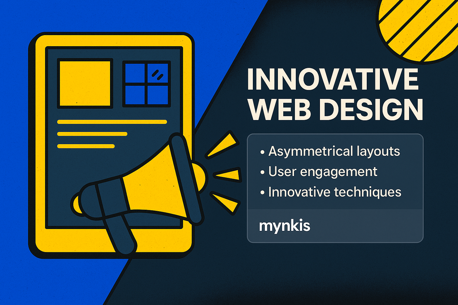
In the world of website design, asymmetry is not just a trend; it's a bold statement that challenges the traditional grid layouts we're accustomed to. I've found that using asymmetrical layouts captures users' attention in a way that symmetrical designs often can't match. This shift towards an unorthodox design approach is particularly beneficial for founders looking to iterate quickly and build scalable solutions without sacrificing aesthetic appeal or user engagement.
An asymmetrical layout in web design is any arrangement where elements are intentionally positioned off-center or in non-uniform patterns. This might mean having text or images on one side that don't mirror the opposite side. While it might sound chaotic, when done right, asymmetrical layouts evoke creativity and direct the user's attention in compelling ways. In my work with startups and entrepreneurs, I've noticed how asymmetrical designs can subtly guide visitors through a site, enhancing the overall user experience.
Asymmetrical designs tap into our innate desire for something new and different. Studies in cognitive psychology, like those discussed by researchers at Harvard, suggest that humans are drawn to novelty and complexity, which can increase engagement. An asymmetrical layout can make a site feel more dynamic and less predictable, encouraging users to explore and stay longer. This principle is particularly useful for MVPs, where getting and keeping user attention is crucial for gathering feedback and iterating the product.
Consider the Apple website. Despite Apple being an enterprise giant, their site often uses subtle asymmetrical elements. These may include varied image sizes and off-center text, which maintain visual interest and guide the eye. Similarly, smaller startups like Buffer have effectively utilized asymmetry. Their landing pages, with one large image on the side and pertinent info on the other, demonstrate how effective asymmetrical designs can be at directing focus. By observing such examples, founders can see the tangible benefits that asymmetry can bring to their own sites.
Designing with asymmetry requires a delicate balance between creativity and functionality. It's not about throwing elements randomly onto a page. Instead, every element should serve a purpose, whether it's guiding the user's eye or emphasizing key information. I've guided many clients through the process of transitioning to asymmetrical layouts and found that while it requires more thought and planning upfront, the payoff in terms of user engagement and aesthetics is well worth it.
One of the challenges with asymmetrical layouts is ensuring they work well across different devices. A design that looks stunning on a desktop may not translate as effectively on a mobile device. However, with careful planning and testing, I've seen how responsive design principles can be integrated to maintain the asymmetrical aesthetic regardless of screen size. Tools like CSS Flexbox and Grid make it easier than ever to adapt asymmetrical layouts for mobile without losing the creative impact.
Start with a clear understanding of your site's objectives and how asymmetry can serve those goals. Use whitespace effectively to prevent your layout from looking cluttered. Choose a focal point and build your design around it to create a natural flow. Also, don't be afraid to experiment. In my experience, the most impactful asymmetrical designs are those that push the boundaries and are willing to be experimental.
The integration of SEO with asymmetrical layouts is another area where founders can innovate. Given the emphasis on user experience in SEO algorithms, an engaging asymmetrical design can enhance site performance. However, it's important to ensure that your layout doesn't compromise the accessibility or readability of your content, as these are also critical for SEO. I've worked with SEO specialists who recognize the potential of well-executed asymmetrical designs to improve both user retention and search engine rankings.
While the benefits are clear, some stakeholders may resist moving away from conventional grid layouts. I've found it helpful to present data and case studies that show the effectiveness of asymmetrical designs. Sometimes, showing a side-by-side comparison of traditional versus asymmetrical layouts helps make the case. It's about balancing comfort with innovation, which is essential for startups poised for rapid growth.
Looking ahead, asymmetry in web design isn't going anywhere. As design technology continues to evolve, the tools available for creating unique and impactful asymmetrical layouts will only improve. For founders, embracing these innovations could be key to staying ahead in an increasingly competitive digital landscape. Asymmetrical design isn't just a trend; it's a strategic tool that, when used effectively, can revolutionize a brand's online presence.