Schedule a Demo
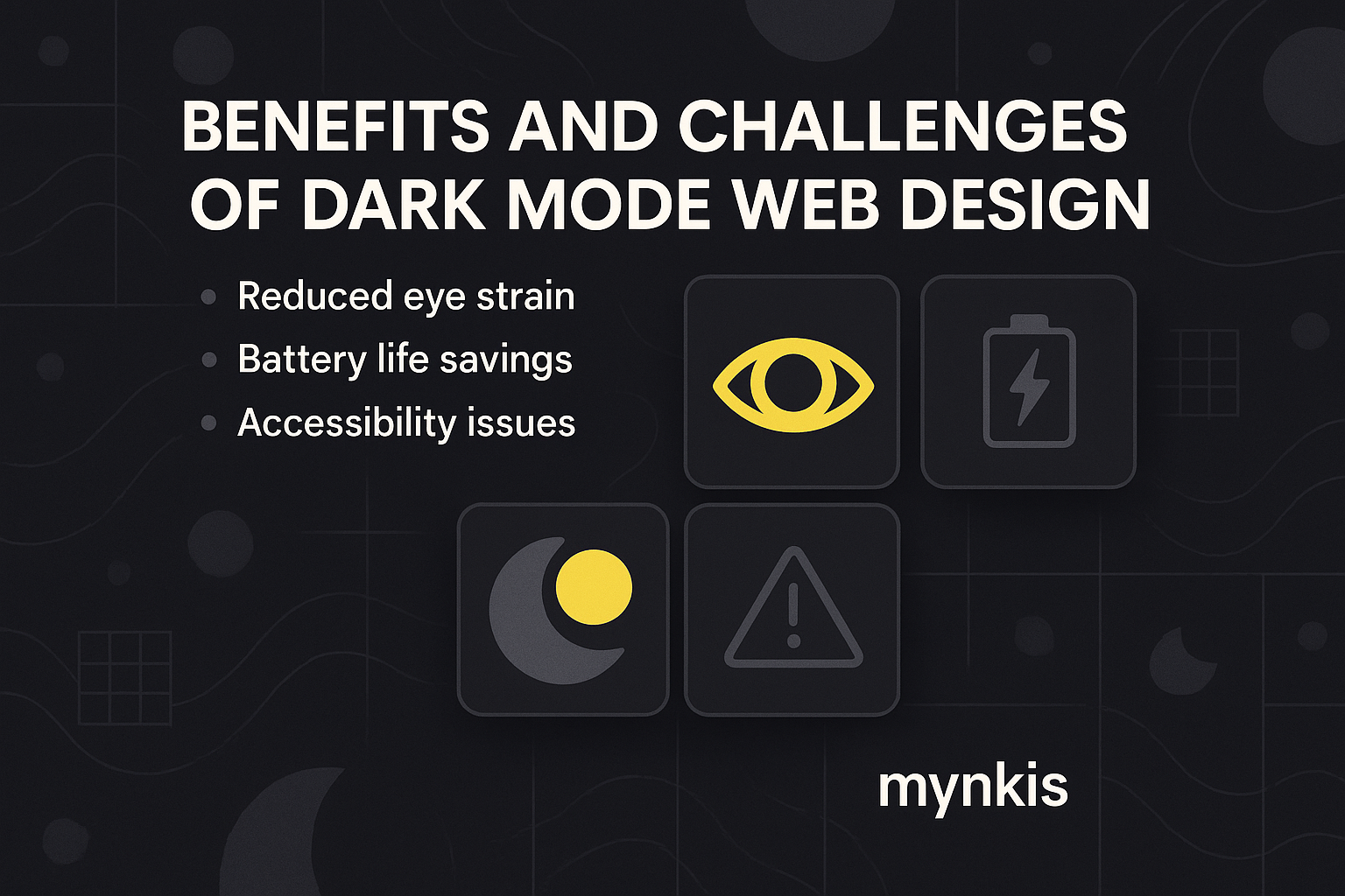
Dark mode has swiftly emerged from the shadows to become a favorite design choice in today's digital interfaces. As a clinical psychologist transitioning into tech, I was initially skeptical about this trend but have come to appreciate the thought and science behind it. We're not just chasing a stylish aesthetic; there's deeper functionality at play. But it's not without its own set of considerations. My experience working with website designers who cater to various practices has shown me that while dark mode can be an effective way to attract clients and showcase expertise, it requires careful implementation to avoid common pitfalls.
First off, dark mode is gentler on the eyes, especially in low-light environments. In my initial observations of patients using digital devices late at night, those with dark mode experienced less eye strain and reported better sleep quality. The reason? Dark mode typically uses less blue light, which is known to disrupt melatonin production. From a design perspective, dark backgrounds allow colors and text to pop, making your website more visually compelling.
I've seen countless websites transition to dark mode and the results are often striking. Dark mode can lend an air of sophistication and modernity, perfect for practices looking to emphasize their cutting-edge services or professional prowess. Whether it's the sleek interface of a legal firm or the modern feel of a wellness center, dark mode can serve as a canvas for bolder branding elements. However, it's important not to sacrifice clarity for style; readability should never be compromised for aesthetic sake.
For practices that prioritize sustainability, dark mode's potential to save energy is a significant benefit. On devices with OLED screens, dark mode uses less power, extending battery life. I recall a session where a tech consultant I worked with showcased how his energy-efficient apps significantly reduced electricity usage on clients' devices. Based on available research, individual results may vary, but the potential for reducing operational costs by embracing dark mode is an attractive proposition for many businesses.
Here's where the conversation gets nuanced. While dark mode can be easier on the eyes, it's not necessarily easier on all eyes. Some visual impairments might find light text on a dark background harder to read. I've encountered practices who implement dark mode universally without options, which can alienate potential clients. Allowing users to toggle between modes is the recommended approach. This flexibility aligns with the principles of universal design and inclusivity, an aspect many practices strive to embody in their mission and operations.
The debate around contrast in dark mode design goes beyond personal preference. Design schools like Stanford's d.school emphasize the role of high-contrast design in ensuring user satisfaction and retention. When properly executed, dark mode can make text stand out, improving readability and user focus. Yet, I've noted instances where the enthusiasm to adopt dark mode led some practices to inadvertently neglect fundamental contrast principles, leading to reduced legibility. Ensuring that your website can still offer a clear path to conversion and information dissemination is paramount.
Even with its allure, dark mode has not been universally embraced. Traditionalists and purists in the design world often argue that bright and light interfaces offer the better user experience. Interestingly, I've seen clients oscillate between light and dark mode due to their preference changes or platform trends. For practices considering the leap to dark mode, understanding client expectations and adapting to shifts in digital culture is crucial.
To transition successfully, certain best practices should be followed. Implementing a smooth, non-jarring switch between modes, ensuring text legibility, and conducting thorough usability testing are key steps. Data from User Experience Magazine corroborates that only with careful user testing can practices fully understand the impact of dark mode on their site visitors. I suggest starting small—perhaps with an optional dark mode toggle—and observe the user data over time before making any long-term commitments.
There's something innovative yet classic about dark mode. In discussions with a designer from the Bauhaus school, we explored how dark mode can be aligned with timeless design philosophies that emphasize function over form. While the darker palette may be trendy, its seamless integration into SEO-optimized sites that convey professional service can, when done right, establish an enduring online presence for practices seeking to enhance their digital image.
Given that over 50% of web traffic now comes from mobile devices, according to Google Analytics data, ensuring dark mode looks and functions well on smaller screens is no longer optional. Practices wanting to look contemporary and appealing to a tech-savvy audience must optimize their websites for mobile and consider the implications of dark mode on such platforms. Lack of proper mobile integration could spell the difference between clinching a new client or losing one due to a subpar user experience.
On the technical front, adopting dark mode presents its own challenges. From CSS adjustments to integrating responsive design principles that can accommodate a switch, practices need to consider the technical know-how required. Data from developers on Medium indicate that while the transition can be managed smoothly with modern web development tools, anticipation of browser compatibility issues and ensuring performance are ongoing concerns. My dialogue with tech specialists illustrates a gradual process necessary for an effective dark mode implementation.
Introducing dark mode must not dilute a practice's brand. One central benefit of dark mode can indeed be the highlighted brand elements, but this should augment rather than obscure your practice's existing identity. From my notes from a branding workshop at Yale School of Management, it's vital that practices take the shift towards dark aesthetics in stride and ensure it complements the brand message that potential clients have come to recognize and trust.
Giving users control over their experience can significantly boost user satisfaction. Drawing from extensive UX research published by the UX Collective, offering a dark mode option but not enforcing it reflects a client-centered approach. When I consult with practices on website design, we often discuss implementing user preferences settings to foster a sense of agency and personalization – key drivers of modern web use patterns.
The allure of dark mode shouldn't distract from your main focus – client engagement and conversions. In reviews from sources like the Journal of Digital & Social Media Marketing, there's a consensus: dark mode is a tool that should enhance rather than overshadow. From psycho-education to legal consultations, if a practice can establish it as part of a holistic UX strategy, then dark mode can effectively complement, rather than merely trend, within your professional online presence.
The decision to go dark should be made with both eyes wide open. Transparency is crucial in evaluating not only the tangible benefits but also potential detractors of dark mode. By considering the full spectrum of implications—from SEO rankings potentially influenced by user engagement metrics to ADA compliance concerns—practices must embrace a balanced decision-making process. Relying on my experience helping clinics tailor their marketing strategies, sometimes less flashy but more functional choices align more authentically with the goals of attracting new clientele and showcasing expertise effectively.