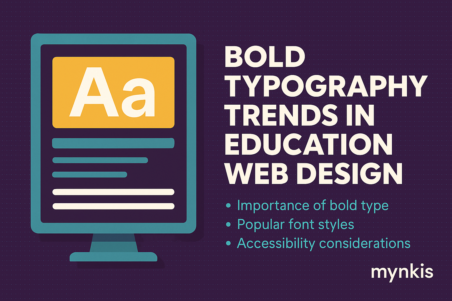
Schedule a Demo
When schools and universities seek to develop cutting-edge websites and learning management systems, the essence of their online presence hinges on visual allure and user engagement. Enter bold typography, an aesthetic choice that packs a punch in commanding viewer attention and setting the tone for educational branding. In my work with higher education institutions, I've seen firsthand how a strategically placed bold font can transform a mundane page into a dynamic learning portal. Crafting such visual flair requires not just an artistic eye but a deep understanding of typographic trends that resonate with today's learners.
Bold typography does more than draw the eye; it amplifies the user experience. Students navigating your website or learning platform must find essential information swiftly, and bold headings do just that. The clarity provided by bold fonts can significantly reduce cognitive load, allowing learners to focus on absorbing the content rather than deciphering the interface. Combined with intuitive navigation, bold text becomes a beacon, guiding users through the educational journey with efficiency and ease. I've seen even the most intimidating system become user-friendly through this transformative design approach.
Let's delve into the heartbeat of current typographic trends that educational websites can't afford to ignore. Variable fonts are rewriting the rules of engagement, allowing website designers to seamlessly morph letters to create distinct looks while maintaining readibility. Moreover, with a touch of experimental flair, irregular font sizes are becoming increasingly popular. This technique adds an element of surprise and variety, essential in keeping students engaged amidst a sea of digital content. Bold sans-serif typefaces, like Helvetica Neue and Open Sans, are also taking the spotlight, celebrated for their modern clean lines that speak the language of today's digital-native learners.
The integration of bold typography isn't merely a design choice; it's also an SEO ally. Search engines value user engagement metrics, and by using bold text to emphasize important keywords, you can enhance those metrics significantly. Bold headings and subheadings act as navigational breadcrumbs, making your site's structure clear to both users and search engines alike. This visibility can lead to improved click-through rates from search results, putting your custom software development into the hands of those who seek innovation in educational tools.
Implementing bold typography goes beyond selecting a punchy font. It's about strategic placement that aligns with user intent and educational goals. For instance, on a university's course registration page, using bold text to highlight the 'Enroll Now' button draws the eye instantly, facilitating a seamless user journey. Similarly, key course deadlines can be accentuated to reduce the chance of overlooked information. Integrating bold typography should be a calculated move, rooted in understanding your audience's behavior and needs.
In embracing bold typography for educational websites, we must not overlook accessibility. A powerful look must remain inclusive, welcoming learners with visual impairments or reading challenges. Balancing high contrast with readability can create an inviting digital space that does not sacrifice boldness for usability. By adhering to web content accessibility guidelines, educators ensure that bold fonts communicate effectively to every member of their digital community.
The bold approach to typography doesn't just engage users—it also reinforces branding. For schools and universities, a unique typeface used in bold can become part of an iconic identity, setting your institution apart in a competitive landscape. When selecting fonts, consider how they reflect the spirit and values of your establishment. A bold yet thoughtful typographic style can encapsulate the educational journey, from innovation and knowledge-seeking to tradition and scholarly excellence.
Looking forward, the role of bold typography in educational design will only grow in significance. As augmented reality and virtual learning platforms become more mainstream, typography will extend into these new dimensions. The ability to see text not just on screens but within interactive 3D environments will elevate the importance of bold visual cues. Educational technology leaders are already exploring how bold fonts can enhance learning experiences in these futuristic settings, cementing typography's place as a pillar of digital education strategy.
Bold typography isn't just a design choice—it influences learning outcomes. Studies suggest that visual cues, such as bold text, can improve information retention and recall. When a school's or university's learning management system employs bold font to draw attention to crucial concepts, it's directly supporting student performance. My experience with enterprise web solutions for academic institutions has shown that judicious use of bold typography can create a lasting educational impact.
As devices evolve, so too must the typography on educational websites. Responsive design ensures that bold text scales gracefully across desktops, tablets, and smartphones. Ensuring your bold fonts are readable and effective on all screen sizes requires thorough testing and adaptation. The goal is to maintain visual impact while providing a seamless experience for every learner, no matter their access point.
The journey to impactful educational design often benefits from collaboration with experts who live and breathe typography. Working with a designer or agency specializing in custom software development that includes robust visual design principles can bring fresh perspectives to your institution's website or learning system. This partnership can unearth new ways to utilize bold typography, from experimentation with letter spacing to exploring text animations that capture the imagination of students.
Highlighting real-world examples of successful bold typography in educational contexts offers inspiration and insight. I recall a project with a renowned university where implementing bold, assertive typography dramatically improved user satisfaction scores. It wasn't just about aesthetics; it was about conveying an institution's ethos, enhancing the sense of academic community, and making essential information shine amid a plethora of content.
Despite its many benefits, bold typography must be wielded with caution. Overuse can lead to a cluttered and overwhelming look, detracting from the learning experience rather than enhancing it. There's also the risk of bold text overpowering important graphics or interactive elements. Balance is the key: bold can be beautiful, but it should enhance, not dominate, the educational narrative.
Finally, emerging technologies like virtual reality (VR) and augmented reality (AR) present novel opportunities for bold typography. Textual elements in these environments can be dramatic and spatial, adding another layer to the narrative of learning. Educational pioneers are experimenting with bold 3D text to create immersive experiences that resonate with today's tech-savvy students, suggesting a future where typography isn't just read but experienced.