Schedule a Demo
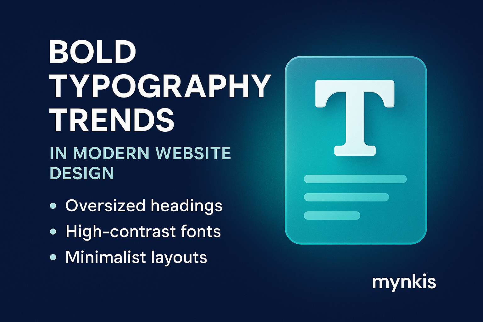
Bold typography isn't just a passing trend. It's a powerful tool that's reshaping website design for businesses, transforming the way users perceive and interact with digital spaces. For founders and C-level executives looking to innovate their web presence through custom software development or MVP websites, understanding the impact of bold typography is crucial.
Bold typography breaks the monotony of traditional websites. It creates a visual impact that captures attention and evokes emotions, helping brands stand out in an increasingly crowded digital world. Especially in enterprise web solutions where branding can differentiate between market leaders and followers, using bold typographic choices can be the element that elevates your user experience.
I've worked with several clients in my career who noticed a significant increase in engagement after reworking their site's typography. For instance, making their mission statement larger and more visible in a unique font not only clarified their purpose but significantly reduced bounce rates.
For startups developing an MVP, incorporating bold typography can provide immediate visual appeal and help set their initial tech infrastructure apart from competitors. Unlike over-polished competitors, an MVP's raw edge can be softened and professionalized through thoughtful font choices. Moreover, it can allow for quick iterations in branding as the product evolves.
While bold typography instantly elevates a design, careful planning ensures scalability as your business grows. Establishing a typographic baseline in your custom software development practices means future adaptations of the website to accommodate new features or a growing product line won't disrupt the aesthetic that once defined your brand.
Today, there's a push towards more expressive fonts where serif and sans-serif are combined for contrast. Key trends include using giant headers to introduce content, creating interactive text elements, and even embracing variable fonts that can adapt across devices seamlessly.
So how does one go about choosing the right bold typeface? Start by aligning the type choice with your brand's identity. Match its weight and style to your messaging's mood: aspirational, assertive, or whimsical. User testing can be particularly useful here, as seen in studies by the Nielsen Norman Group which reports a direct correlation between user experience and carefully chosen typography.
In corporate environments, bold typography must balance between being audacious and professional. As I've consulted for enterprise clients, ensuring accessibility becomes paramount; text must be legible while making a statement. Adapting font styles across touchpoints—from desktop to mobile—to maintain the integrity of bold statements has been a key challenge and opportunity.
Tech and financial sectors tend to approach bold typography with measured flair, maintaining industry-standard professionalism. However, creative industries might embrace quirkier displays. Understanding your sector will guide whether your typography should be more subdued or become a signature trait of your brand. Keeping up with typographic trends across specific business domains opens conversations with your target audience more directly.
Take Dropbox's redesign: sleek, minimal with bold headers and interactive elements that guide users intuitively. Or, consider Airbnb, which deployed bold text alongside high-quality images to tell compelling story-driven content pieces about destinations. These brands took bold typography and made it pivotal to user journey mapping.
Bold type selections require careful management; they can disrupt user flows if overdone. Yet underused, it might not provide the vitality some digital experiences crave. This balance—implored in user-centered design principles suggested by leading accessibility guidelines like WCAG—is what allows brands to charm without overwhelming.
Incorporating bold typography means thoughtful integration into your broader software architecture. The same care taken to craft MVPs needs to transition seamlessly as enterprise applications are scaled up. Type choices might vary across marketing pages and product environments but maintaining a harmonious set of fonts validates a strong brand identity recognized at every touchpoint.
The wave of bold typography is set to continue its ripple effect across all areas of web design. Founders, before investing in substantial custom software development, can refine what typography choices anchor users visually. It's this interplay between form and function that keeps users captivated and touches a brand's long-term tech evolution.
To harness the force of bold typography, align it well within your branding strategy. Brands should explore the big-and-bold approach regularly, testing, tweaking, and adapting. There's no one-size-fits-all here—crafting a typographic narrative unique to your story can engage like no other aspect of your business website and its ensuing solutions for customizable tech advancement.
