Schedule a Demo
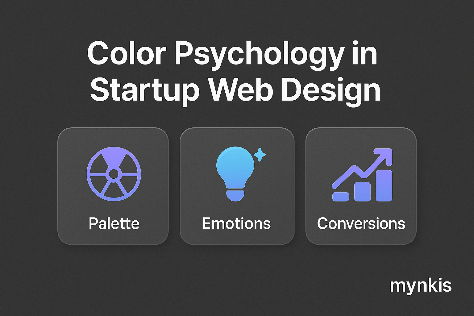
When it comes to designing the perfect MVP website or scalable software solution, the selection of color is far more than an aesthetic choice. It's a strategic tool that can significantly influence user behavior and perceptions. In my work with founders looking to iterate quickly and effectively, I've seen firsthand how a well-thought-out color scheme can pave the way for long-term success. Based on research from the Institute for Color Research, colors can account for up to 90% of an initial user's reaction to a product. This startling statistic underscores the importance of choosing colors wisely when designing a digital presence that needs to evolve as your startup grows.
Color psychology delves into how colors impact human emotions and behaviors. For instance, red is often associated with energy, urgency, and passion. Integrating red into key call-to-action buttons, for instance, can subtly urge visitors to take immediate action on your website. Conversely, blue is linked with trust, stability, and calmness. I once consulted with a fintech startup that chose blue as their primary color for their MVP site; this choice helped cultivate a sense of security and reliability among their early adopters. By selecting colors that align with your startup's core values and target audience, you can foster the right emotions and behaviors.
Your color choices also play a pivotal role in developing your brand identity. For a startup, defining a strong brand from the get-go is crucial for scalability. A well-defined color palette not only sets your business apart but can also endure through multiple iterations of your product. For example, if your startup revolves around environmental technologies, using greens and earth tones could reinforce your commitment to sustainability. This was evident in a project I managed for an eco-friendly startup, where a thoughtful use of green not only resonated with their ethos but also built brand affinity from the start.
When designing for a specific demographic, consider the psychological profiles of your target audience. A study from HubSpot shows that age, culture, and gender can significantly alter how different people respond to colors. Younger audiences might gravitate towards vibrant, energetic colors like magenta or orange, which can stimulate excitement and engagement on your site. For an established audience, perhaps focusing on more neutral or classic hues could project the maturity and professionalism your venture needs as it scales.
Achieving color harmony on your site is key to ensuring a user-friendly experience that can support quick iterations in your development process. Complementary colors, as suggested by the Color Harmony Guide, can create a visually pleasing and cohesive design, allowing for seamless adjustments as your MVP evolves. Balancing bold colors with neutral backgrounds can also enhance readability and user interaction, crucial when your infrastructure needs to adapt to user feedback in real time.
In the MVP development stage, every aspect of your site should be open to testing and tweaking – colors included. I've guided numerous founders through A/B testing sessions where we experiment with different hues on their web designs. Changing a single color on a CTA button can sometimes result in a surprising increase in user engagement. Through iterative testing, you can gather invaluable data on how your color selections influence user actions and refine your color palette accordingly for future iterations.
As your startup grows, so too must your brand's color strategy evolve. It's important not just to think about the immediate impact of your colors but also how they will fit into your long-term tech infrastructure. When designing scalable solutions, consider how your colors might look across different platforms, from mobile apps to enterprise software. Remember the principle of consistency; keeping your colors cohesive can make your brand instantly recognizable, which is invaluable for startups aiming to make an impact in competitive markets.
Looking at successful startups, we can see the power of color psychology in action. Take Dribbble, for example, which uses a friendly purple to foster a sense of community and creativity among designers. Or consider Trello, with its bright blue interface that suggests productivity and organization. These companies carefully crafted their color palettes to convey their core messages and stand out in crowded marketplaces, which is something all founders should aspire to do.
In leveraging color psychology for your website design, it's easy to fall into common pitfalls. One error is overloading your site with too many colors, which can overwhelm users and dilute your brand's message. Additionally, a choice that's trendy now might feel dated in a couple of years. The lesson? Opt for timeless colors rooted in your brand's values over fleeting trends. From my experience with startup clients, creating a balanced palette that's scalable and maintains emotional impact over time can make all the difference.
At the heart of a well-designed MVP or scalable software lies the balance between aesthetics and functionality. While colors are important for evoking the right feelings, they should also serve a functional purpose. Ensuring there's enough contrast for text readability or using color to guide users through a seamless user journey is just as important as the emotional resonance of your chosen palette. As Mynkis, and as your tech partner, we believe this balance is essential for creating solutions that not only look great but perform brilliantly across the evolution of your business.
It's not enough to choose colors for their psychological impact; startups must also consider accessibility standards. Ensuring that your MVP website adheres to WCAG (Web Content Accessibility Guidelines) can be a vital step in making your platform inclusive. Utilizing tools like the WebAIM Color Contrast Checker can help align your palette to meet these standards, ensuring your site is usable by as broad an audience as possible, an imperative as your user base expands.
Looking ahead, the future of color in web design for startups will likely embrace personalization and adaptability. With technologies like AI and machine learning, websites might soon adapt their colors dynamically based on individual user preferences or behaviors. This could redefine how startups approach scalability, offering personalized experiences that cater directly to user needs and emotions as part of your long-term tech infrastructure.
While color is a powerful design element on its own, its impact is heightened when combined with other design choices. Consider the typography, imagery, and layouts of your site. Each should work in concert with your color palette to reinforce your startup's message and identity. As I've often found in my projects with founders, a cohesive integration of design elements can not only enhance the aesthetic appeal but also clarify the user's path through your product, which is key for iterative development.
Finally, as your startup's website and software evolve, consider how transitions between colors can impact the user experience. Using a well-timed fade or color-shift in your design can guide users through a desired narrative or sequence of actions on your platform. This psychology of movement through color transitions can be particularly effective for guiding users through the various stages of product development, ensuring they feel connected and engaged as your MVP and subsequent iterations roll out.