Schedule a Demo
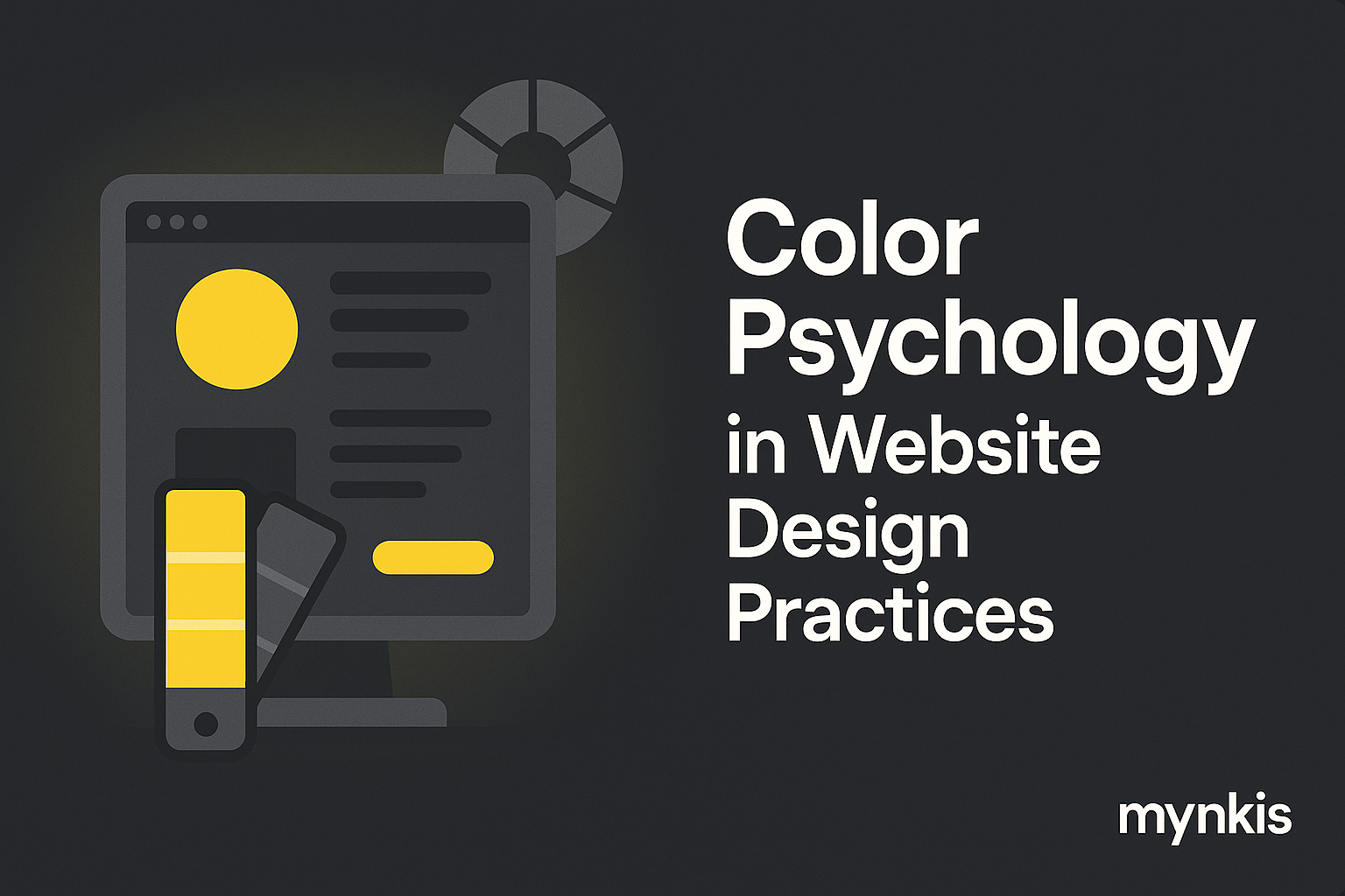
Color is more than just an aesthetic choice; it's a powerful tool that influences emotions, behaviors, and even decision-making. When designing websites for practices aiming to attract clients and showcase expertise, understanding color psychology becomes essential. In my work with various design projects, I've found that clients respond differently to colors based on their unique cultural backgrounds and personal preferences. This variation highlights the need for a tailored approach, ensuring that the chosen palette not only looks good but also aligns with the intended audience's psychology.
Research in color psychology reveals that different colors can trigger specific emotional responses. For instance, blue is often associated with trust and calmness, making it an ideal choice for healthcare and professional services websites. Red, on the other hand, can stimulate urgency and excitement but may be overwhelming if used excessively. Based on available research, these color associations can significantly impact visitor perceptions and engagement on a website. However, individual results may vary as cultural differences play a significant role in how colors are perceived.
One striking example from my portfolio involved a dental practice looking to revamp their website. They chose a palette of calming blues and soft greens, inspired by natural environments, which not only elevated the visual appeal but also conveyed a sense of peace and trust to their prospective clients. This approach resulted in a noticeable increase in patient inquiries and overall satisfaction with their online presence. Similarly, a law firm adopted a more conservative palette of dark blue and gray, which reinforced their brand's professionalism and reliability.
Consistency in color usage across all elements of a website, from the header to the footer, is crucial for creating a cohesive user experience. In a digital world where attention spans are short, a disjointed color scheme can detract from the overall message a practice wants to convey. Whether it's a subtle gradient or a bold, solid block of color, maintaining a unified look ensures that the website's purpose and values are clearly communicated to potential clients.
When designing a website, it's essential to align color choices with existing branding elements. For practices with established logos and marketing materials, the website's color scheme should enhance and extend these established visual cues. I often collaborate with clients to explore how they can leverage their brand colors to create a seamless transition from their offline to online presence. This continuity not only reinforces brand identity but also builds a stronger connection with visitors.
Cultural nuances significantly impact how colors are perceived, and this must be taken into account when designing for a diverse clientele. For example, white is often associated with purity in Western cultures but symbolizes mourning in some Eastern cultures. Understanding these cultural color associations allows designers to craft websites that resonate with a global audience, ensuring inclusivity and relevance.
While color choices are primarily about user experience, they can also play a subtle role in SEO. A well-designed, visually appealing website often leads to higher engagement rates, which in turn can improve search engine rankings. Although color itself isn't a direct SEO factor, the right palette can enhance the user's time on site and reduce bounce rates, signaling to search engines that the site provides valuable content and experiences.
Selecting the right colors can be daunting. Here are a few practical tips:
Beyond overall aesthetic, color plays a crucial role in actionable design elements such as call-to-action (CTA) buttons and navigation menus. For instance, a bright, contrasting color like orange or green can draw attention to your CTAs, encouraging visitors to take the next step, whether it's making an appointment or downloading a resource. The right color choices can significantly influence visitor actions and help achieve the practice's conversion goals.
While it's tempting to let aesthetics drive every decision, it's essential to balance the look of the website with its functionality. Colors should enhance user experience rather than detract from it. In practice, this means ensuring text is readable against backgrounds and that there's sufficient contrast to aid navigation and comprehension. A site that prioritizes functionality will ultimately serve its users better and align more closely with their needs.
Once a color scheme is in place, it's important to analyze its effectiveness and be willing to iterate. Tools like Google Analytics can help track user engagement and identify areas where color might be influencing behavior. If certain pages have high bounce rates, perhaps the color scheme is too overwhelming or off-putting. Continuous refinement based on real-world user data ensures that your website remains optimal and effective over time.
The field of color psychology is continually evolving, and new trends emerge as designers explore innovative ways to influence user behavior. For instance, muted pastels are gaining popularity for their calming effect and have found a place in wellness and healthcare websites. Keeping an eye on such trends allows practices to stay current and engage their audiences in fresh, meaningful ways.
While color psychology offers valuable insights, it's not a one-size-fits-all solution. Other elements like layout, content quality, and user experience also play crucial roles in the success of a website. Practices should view color psychology as one part of a larger strategy to create engaging, client-attracting web experiences.
For practices aiming to optimize their websites through color psychology, engaging a professional design expert can be a game-changer. An experienced designer can bring a depth of knowledge about current trends, cultural nuances, and effective color strategies to ensure the website not only looks great but also performs effectively in attracting and retaining clients.