Schedule a Demo
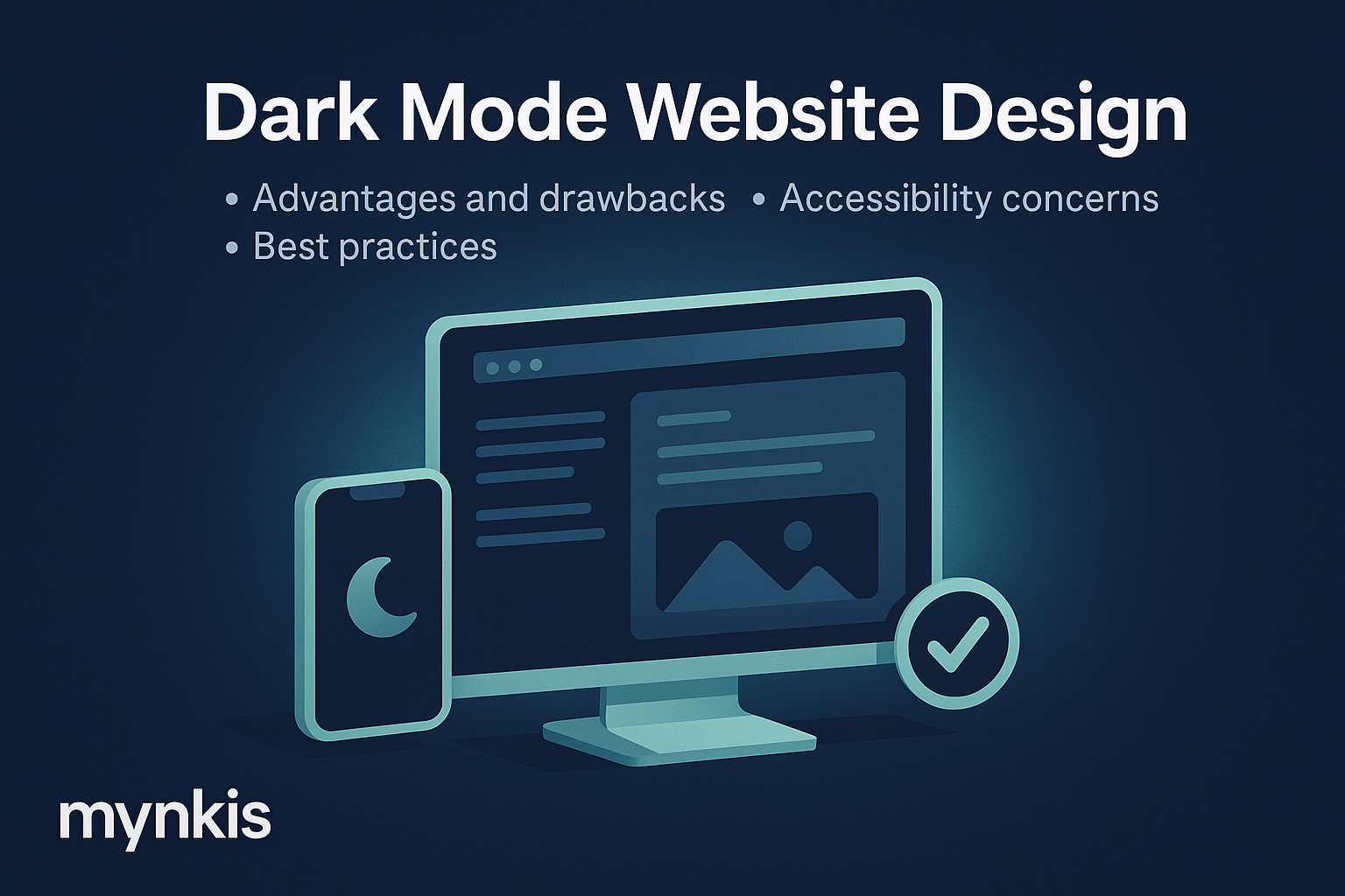
When designing a B2B website optimized for lead generation through SEO, one trend that can't be ignored is the shift towards dark mode. I've worked with clients across various sectors who have shown a keen interest in this aesthetic not just for the sake of following trends but due to tangible benefits. However, it's crucial to weigh these against potential drawbacks.
One of the most touted benefits of dark mode is its energy efficiency, particularly on OLED screens where black pixels use significantly less power than bright white ones. This not only aids in reducing battery drain on mobile devices but can be especially appealing for environmentally conscious businesses looking to promote sustainability as part of their brand ethos. Yet, it's important to recognize this advantage primarily benefits screens with OLED technology, leaving devices with LCD screens largely unaffected.
I've noticed in my interactions with operations managers and executives in tech-intensive industries, that users of software applications often cite reduced eye strain as a primary reason for preferring dark mode interfaces. Users can experience less discomfort during prolonged screen time, a consideration for business platforms designed for longer sessions. But, it's worth mentioning that the level of perceived comfort can vary significantly among individuals, making it a less universally applicable benefit.
Another touted advantage, and one which comes up regularly in discussions around custom software development for enterprise, is that dark mode can sometimes enhance focus. When elements like white text against a dark background provide sharp contrast, users may find it easier to concentrate, potentially increasing productivity in software applications or on enterprise websites. Yet, ensuring this contrast doesn't diminish other content readability requires a meticulous design approach.
While the benefits may sound compelling, consider the branding implications when integrating dark mode. As a designer, keeping a brand's identity consistent becomes a bit trickier. Whites must become blacks and light colors swap to darker shades, potentially disrupting brand recognition unless thoughtfully planned. This seamless transition from traditional to dark requires a deeper dive into design nuances, impacting both the application's appeal and its ability to convert leads through well-implemented SEO.
Not everyone benefits from a shadowy backdrop. Based on my experiences working with various clients designing automation software, dark mode must be approached cautiously as it can lead to decreased readability for users with visual impairments, such as low vision or color blindness. A website might rank high in SEO but could be effectively alienating a segment of users if not designed thoughtfully. Thus, the requirement for alternative high-contrast modes becomes imperative to accommodate diverse user needs.
Interestingly, the transition to dark mode can introduce challenges with user interfaces where traditional elements lose their visual cues. Take, for instance, a B2B website's navigation menu; in dark mode, the reduced contrast could make buttons or links less noticeable, potentially disrupting the user's journey and diminishing the goal of lead generation through straightforward navigation. This highlights the ongoing need to balance design trends with usability and accessibility considerations.
From a purely technical standpoint, the shift towards a dark interface may increase development costs. Drawing from my experience, the addition of a dark mode for enterprise web solutions often means an expanded project scope. You're essentially designing and testing two interfaces to ensure seamless transitions and consistent user experience. These implications should be considered early in the custom software development planning process.
An aspect often glossed over is the potential impact of dark mode on SEO. As we tailor websites for lead generation, maintaining optimal website performance and loading speed is key. A poorly executed dark mode implementation can affect load times due to heavier asset loading. Therefore, striking the right balance between aesthetics and practical SEO elements becomes an intricate dance during website design initiatives.
So, where does this leave firms contemplating whether to dive into the darkness? My best advice? Keep an ear to the ground on user feedback. It's easy to get swept up in trends, but sustainable success in enterprise web solutions hinges on serving your users. Involve them in the process through user testing and reassess design approaches based on real user data, ensuring your dark mode integrates well with both your branding and users' needs for efficiency, accessibility, and SEO.
As we peer into the future of custom software development and web design, trends such as dark mode will likely evolve with new technology enhancing their benefits or even revealing new advantages or challenges. My team and I continually adapt, striving for designs that are not only visually compelling but also user-centric and inclusive, meeting all client objectives in today’s complex business landscape.
Here are practical strategies for those looking to incorporate dark mode effectively into enterprise-level solutions:
