Schedule a Demo
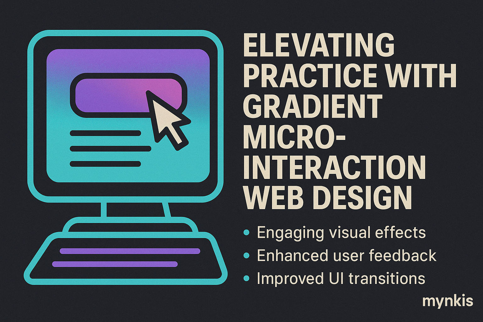
Gradients have made a bold comeback in the design world, transforming the way modern websites capture attention and convey emotions. In my work with various practices, I've observed a significant shift towards gradients as a tool for enhancing visual appeal and creating a seamless user experience. What started as a trend has now become a staple in the toolkit of contemporary web designers.
The versatility of gradients allows them to be used in a multitude of ways. From subtle backgrounds to vibrant button designs, gradients add depth and dimension to webpages, making them more engaging for visitors. A practice's website can reflect its personality and professionalism through thoughtful use of color transitions, which can be both calming and striking.
I've seen practices successfully implement gradients to emphasize key areas of their site, such as calls-to-action or service listings. According to a recent study by Adobe, over 70% of users find gradient backgrounds more appealing than solid colors, suggesting that incorporating gradients can positively impact user experience and, ultimately, client acquisition.
Micro-interactions, those tiny animated details, are another powerful tool in the arsenal of today's web designers. They enhance user engagement by providing instant feedback and guiding user behavior through the site. In my consultations with practice owners, I've found that micro-interactions can transform an ordinary web experience into an interactive journey, making visitors feel connected to the practice.
Whether it's a subtle animation when hovering over a link or a dynamic transition between sections, micro-interactions are designed to delight and surprise users. They're not just for tech-savvy clients; according to a report by Forrester, even users who may not explicitly notice micro-interactions report a more satisfying overall experience.
The key to effective micro-interactions is subtlety. They should enhance the user's journey without overwhelming it. I've helped practices implement everything from progress indicators for long-form content to animated transitions that make navigating through a site's services more enjoyable. These small touches, when used correctly, can significantly boost user satisfaction and time spent on the site.
When gradients and micro-interactions are combined, the result is a dynamic and visually stunning website that can elevate any practice's online presence. In my experience, the most successful websites integrate these elements seamlessly, creating a cohesive look and feel that resonates with both existing and prospective clients.
Take, for example, a medical practice's website. A gradient background on the landing page paired with micro-interactions on service icons can convey a sense of professionalism and modernity. It sets the tone for the entire user experience and can be particularly effective in drawing in clients who prioritize innovation in healthcare.
I've seen practices in various fields, from dentistry to law, use this combination to highlight their brand's values. For instance, a law firm might use a subtle gradient to denote stability and reliability, while micro-interactions on contact buttons encourage immediate engagement with potential clients.
While focusing on the aesthetics of gradients and micro-interactions, it's crucial not to overlook the importance of SEO for attracting clients to your practice's website. In my experience, practices that balance visual appeal with search engine optimization see the best results in terms of both visibility and client engagement.
SEO involves optimizing site structure, content, and keywords to ensure your practice ranks higher in search engine results. A well-designed site with gradients and micro-interactions can be an asset, but only if it's also accessible to search engines. This means ensuring that your site loads quickly, is mobile-friendly, and uses keywords effectively.
As of my latest insights from working with practice owners, the use of gradients and micro-interactions, when implemented correctly, does not hinder SEO efforts. In fact, they can enhance user engagement, which is a positive signal to search engines. However, care must be taken to balance the use of these design elements with clear, SEO-optimized content.
The ultimate goal of incorporating gradients and micro-interactions into a practice's website is to create an inviting and effective platform that aligns with the practice's ethos and client needs. In my collaborations with practices, I've seen firsthand how a well-thought-out design can lead to increased client inquiries and a stronger online presence.
It's vital to balance creativity with usability. While gradients and micro-interactions can make a site stand out, they must serve a purpose and enhance the user's ability to find and engage with the practice's services. Based on available research, individual results may vary, but the key to success lies in a user-centered design approach.
I encourage practices to consider their audience when experimenting with these design elements. For instance, younger demographics might appreciate bolder gradients and more dynamic micro-interactions, while a more traditional clientele might prefer subtler implementations. Understanding your target audience and what resonates with them is fundamental to the success of your practice's website design.