Schedule a Demo
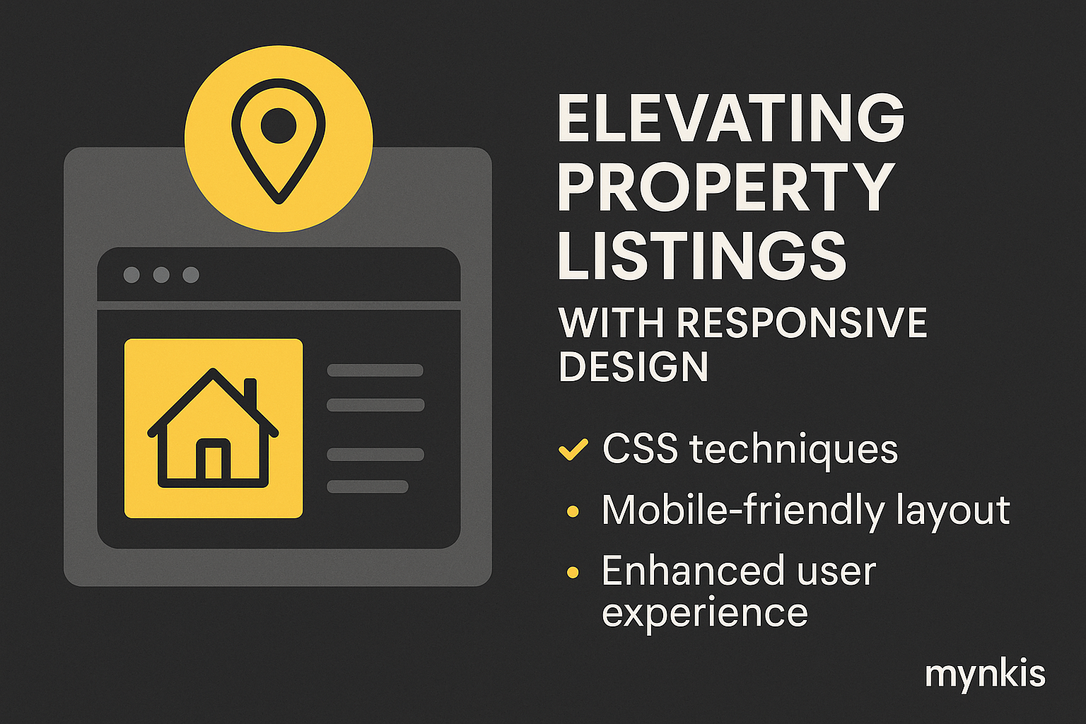
In my work with brokers and real estate professionals, I've seen a significant uptick in clients accessing property listings via mobile devices. That's why mastering CSS for responsive web design isn't just a nice-to-have; it's essential for meeting customers where they are. By ensuring your property listing website performs impeccably on any device, you greatly enhance the user experience and, consequently, your listings' visibility and engagement.
Flexbox, an excellent CSS layout module, should be at the forefront of your website's design strategy. It offers unparalleled ease in arranging property listings into dynamic, user-friendly grids or lists. Whether your site visitor is on a smartphone or a desktop, Flexbox ensures that elements like images and details align perfectly. In practice, I've used Flexbox to create property carousels that adapt effortlessly to different screen sizes, enhancing both the aesthetic appeal and functionality of the site.
When dealing with properties that require more detailed views or comparisons, CSS Grid Layouts are incredibly powerful. They allow you to structure your content in two dimensions, perfect for displaying complex listings. For instance, I've created layouts where you can easily compare different home features side by side, essential for listings in competitive markets like San Francisco. This approach not only helps in engaging potential buyers but also ranks higher in search engine results due to enhanced usability.
Media Queries are the heart of responsive design. They allow your property listing website to adjust seamlessly based on the user's device screen size. In my experiences assisting real estate agencies with online presence, implementing media queries has led to a notable improvement in mobile user retention rates. From hiding non-essential content on smaller screens to adjusting font sizes for better readability, the meticulous use of media queries can dramatically impact how users perceive and interact with your listings.
In the context of real estate, images are the king of conversion. Yet, without proper optimization, they can significantly slow down your website, especially on mobile. I've utilized CSS techniques like background-size and object-fit to ensure images don't overpower their containers, resulting in quicker load times and a smoother browsing experience. Additionally, applying responsive images through the srcset attribute has shown to improve not only the site speed but also the SEO scores by tailoring the right image size to the user’s device.
Readability is crucial, particularly when potential buyers are squinting at property details on their phones. Fluid typography allows text to scale smoothly between different breakpoints, ensuring every listing detail is crystal clear. From my consultations with clients in real estate, integrating this technique has markedly improved the clarity of property descriptions across various devices. It also contributes to better SEO as search engines favor well-structured, easily readable text.
While traditional desktop users enjoy hover effects, touch interfaces require a different approach. Customizing CSS for touch can make features like expandable property images or interactive maps far more accessible on mobile devices. In developing several real estate apps, I've implemented subtle animations and responsive touch areas that do not detract from the user experience but enhance interaction. Touch-friendly design doesn't compromise the desktop experience but is essential for a truly responsive site.
Conditional loading techniques in CSS can drastically reduce the initial load time of your property listing page. By loading only the necessary styles for the initial viewport and then progressively adding more as needed, you provide an instant feel to the website visitor. I've seen this approach not only improve user retention but also contribute positively to SEO rankings as site speed is a critical factor in Google's algorithm.
While mastering CSS, don't overlook cross-browser compatibility. Different browsers can render your responsive property listing website differently, potentially affecting both user experience and SEO rankings. To maintain high standards, I always test my designs in multiple browsers, often using tools like BrowserStack. Ensuring your site looks good and works well on Chrome, Firefox, Safari, and Edge is essential for reaching the broadest possible audience.
Looking ahead, responsive design will only become more critical as devices evolve. The integration of AR and VR in property viewing, alongside continually increasing mobile traffic, signals a future where versatile, adaptive design will be paramount. Preparing for these developments involves staying abreast of CSS innovations. I regularly monitor resources like the W3C for updates on CSS specifications and advanced design strategies, allowing me to keep my clients' listings ahead of the curve.
To deepen your understanding and application of CSS for responsive design, especially in real estate, here are a few recommendations. For beginners, MDN Web Docs provides a comprehensive introduction. More advanced learners might find CSS-Tricks and its case studies useful. Lastly, the official W3C specifications keep you updated on the latest in web technologies.
Implementing these CSS techniques in your property listing website will ensure it ranks well for local SEO queries and offers an exceptional user experience. Whether adapting to various screen sizes with Flexbox or optimizing images for quicker load times, each step taken toward responsive design contributes to both visibility and client satisfaction. And while based on available research, individual results may vary, keeping your website ahead of the design curve is a necessity in today's real estate market.