Schedule a Demo
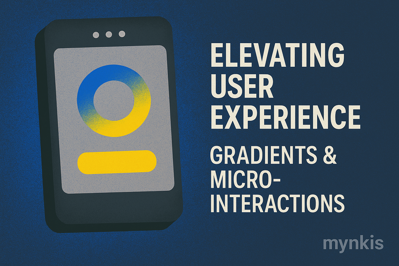
In the realm of website design, the use of gradients and micro-interactions stands out as a beacon of modern aesthetics and user engagement. These elements, when skillfully applied, can transform a mundane site into an engaging platform that not only catches the eye but also enriches the user's journey. As founders seek to develop scalable software solutions and MVP websites, understanding how to leverage these design features becomes crucial for creating lasting impressions and facilitating rapid iteration.
Gradients are more than just a visual flourish; they're a strategic design choice that can convey mood, focus attention, and create depth within a digital space. In my experience working with startup founders, I've seen firsthand how a thoughtfully implemented gradient can make a website feel more dynamic and appealing. The trick lies in balancing subtlety and impact, ensuring the gradient enhances rather than overwhelms the user experience.
The evolution of web design has seen gradients go from garish to sophisticated. Smashing Magazine highlights how modern gradient techniques can lend a website a sleek, contemporary feel, akin to the latest tech startups vying for a fresh brand identity. While gradients can add visual interest, it's critical to align them with the brand's messaging to avoid diluting the intended effect.
Micro-interactions are the unsung heroes of user experience design. These small, yet meaningful animations or visual cues serve to guide users and provide feedback, enhancing engagement and overall satisfaction. Consider a like button that subtly shifts color when clicked, or a form that animates the completion of each step; these tiny details, when experienced en masse, contribute significantly to a seamless user journey.
From my perspective, micro-interactions represent the fine-tuning of a user interface. They provide immediate responses to user inputs, making digital interactions feel more human and responsive. According to the Nielsen Norman Group, well-implemented micro-interactions can lead to higher user retention and more intuitive navigation.
When building scalable software solutions, especially for MVP websites, the inclusion of micro-interactions can facilitate rapid testing and iteration. By observing how users interact with these elements, founders can quickly identify what resonates with their audience and refine their design accordingly.
The key to effectively incorporating gradients and micro-interactions into website design is to strike a balance between aesthetics and functionality. A gradient might look fantastic on the homepage, but if it detracts from the readability of essential content, it's a misstep. Similarly, an overabundance of micro-interactions can overwhelm and frustrate users, turning what should be a helpful tool into a source of annoyance.
In working with clients from various sectors, I've noted that a minimalist approach often yields the best results. A few, well-placed gradients can create a subtle yet impactful visual hierarchy without distracting from the core content. Likewise, micro-interactions should be implemented thoughtfully, perhaps only for key actions, to avoid visual clutter.
For startups focused on long-term tech infrastructure, such design choices also play into the scalability of the website. A clean, well-optimized design that uses gradients and micro-interactions judiciously will be easier to scale and maintain over time, ensuring that as the company grows, its digital footprint remains polished and efficient.
When integrating gradients into your website, consider using them to frame important sections or to transition between different parts of the page. This not only creates a seamless flow but also guides the user's attention in a deliberate way. A practical tip is to ensure that the gradient's colors reflect your brand palette, maintaining consistency across your site's look and feel.
As for micro-interactions, always begin with user testing. Gather feedback on which actions should trigger animations, and keep iterations simple. Based on my experiences, users often appreciate straightforward cues rather than complex sequences that might be visually distracting. Remember, the goal of micro-interactions is to enhance usability, not to showcase the design capabilities of your MVP website.
Finally, don't underestimate the importance of accessibility. Gradients should maintain legibility, and micro-interactions must be smooth and non-disruptive to ensure an inclusive user experience. This focus on accessibility is a principle upheld by technology leaders like W3C Web Accessibility Initiative, ensuring that your scalable software solutions reach and resonate with as wide an audience as possible.
The use of gradients and micro-interactions is poised to continue evolving, pushed forward by advances in technology and changing user expectations. As web and software development progresses, we're likely to see even more sophisticated implementations that create more personalized and interactive experiences. The forward-thinking founder must stay attuned to these trends, utilizing them to craft MVPs and scalable platforms that are not just functional, but also engaging and ahead of the curve.
Looking to the future, it's important to consider how emerging technologies like augmented reality or AI-driven interfaces might further integrate gradients and micro-interactions into seamless digital experiences. Such innovations could redefine how users interact with your software, turning everyday tasks into immersive engagements that strengthen the bond between the user and the brand.
Ultimately, the most successful founders will be those who recognize the value in every design element, leveraging them not just for their visual appeal but for the experiences they can shape. In a landscape where competition for user attention is fierce, it's the nuanced, well-designed details—like gradients and micro-interactions—that can set your software and website apart, ensuring your venture's growth and sustainability in the long run.