Schedule a Demo
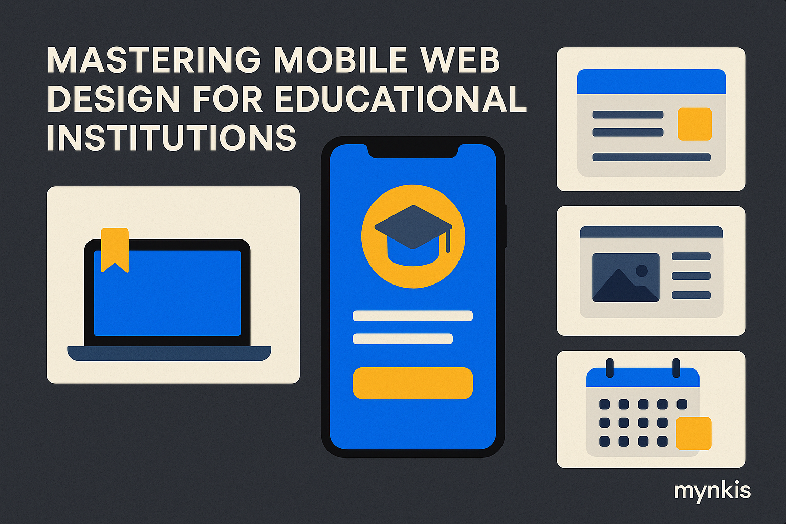
The rise of smartphones isn't news, but their impact on web navigation, especially within educational institutions, is critical. In my consultations with school administrators, I've seen firsthand how students accessing learning management systems on their mobiles has reshaped web design needs. As a result, adopting a mobile-first approach isn't just recommended; it's essential.
Consider the typical user: a student frantically checking their next class on their phone between lectures. Thumb-friendly navigation is not just beneficial but crucial for these mobile users. Enlarging touch targets and ensuring menus are easily accessible from any screen position can transform a student's digital experience, as statistics from organizations like the Web Accessibility Initiative illustrate. A thumb rule (no pun intended) is to maintain at least 44 x 44 pixels for all touch targets, ensuring a smooth and effective interaction.
But responsiveness isn't just about adjusting to screen size; it's about adapting content dynamically. For schools and universities, where custom software development often tailors to specific curricular needs, this is paramount. I've worked on projects where flexible grid layouts allowed for a richer, more interactive LMS on mobile devices, significantly enhancing the learning process.
With the rise of digital classrooms, the urgency of website speed on mobile devices becomes non-negotiable. The research from Google has demonstrated that page loading times under three seconds keep user engagement high, a principle that should be a north star for any enterprise web solution. As one navigates from coursework to institutional announcements, a lag can drop engagement levels drastically.
When every pixel counts on a small screen, the content hierarchy must be reimagined. It's about making what's most important unmistakably clear. For an academic institution, this might mean placing course schedules, exam dates, and grade updates at the forefront, insights I've gleaned from observing how students interact with learning platforms on their phones.
Clutter not only hinders readability but also bogs down the mobile experience. I've learned from seasoned educators that students prefer streamlined, easy-to-navigate sites where key information pops. Schools should lean toward minimalism, reducing visual noise so essential functionalities like assignment uploads and online class access stand out.
Strategic use of visuals can significantly boost engagement. Schools might prioritize immersive images of campus life or short video clips from recent lectures, but ensure they're optimized for rapid loading. Mobile optimization tools suggest compressing files without losing quality, a balance I strive for in projects aimed at enriching the educational experience through multimedia.
The commitment to inclusivity extends to your mobile website. Based on the available research, individual institutions may find varying levels of success in adhering to WCAG guidelines, but the aim remains clear: making education equally accessible. From color contrast to text size, ensuring all students can engage with your institution's digital interface reinforces your dedication to equality in education.
You don't want your best-laid plans undone by unforeseen bugs. In my experience with schools transitioning to mobile-first strategies, extensive testing on various devices ensures a seamless user experience. What works on an iPhone may falter on an Android, requiring a diversity of testing to ensure all students experience the same level of institutional digital ease.
Why stop at design when you can bolster your institution's reach with mobile SEO? Insights from leading educators point toward the value of mobile-friendliness influencing search rankings, a golden opportunity for schools and universities. By optimizing images, using structured data, and focusing on custom software development best practices, you can attract and retain an ever-mobile audience.
Let's not forget our audience: the students and faculty. Inviting feedback on mobile website features is a practice I uphold in projects, encouraging iteration that matches user needs. This interactive approach not only engages users but shapes an environment dedicated to continuous improvement, particularly pertinent for evolving enterprise web solutions.
Mobile access brings new security challenges. I've observed institutions invest in securing mobile websites as they would a digital fortress, ensuring student data and institutional credentials remain protected. A comprehensive security strategy must account for the unique vulnerabilities presented by mobile access, a critical layer in the modern learning management system.
To improve, we must measure. Analytics tools tailored for mobile sites illuminate how students interact with your digital institution. This data drives better decision-making around custom software development, from site speed enhancements to menu restructuring, ensuring the institution's resources cater directly to the engaged mobile user.
Why not explore what's beyond? Schools can leverage unique mobile features like augmented reality for campus tours or instant notifications about course updates. My work with top-tier academics has shown these innovations not only enhance the user experience but also push the boundaries of what educational institutions can offer in a mobile-centric world.