Schedule a Demo
In my years of working with various practices eager to refine their online presence, I've noticed a clear shift towards mobile usage across all industries. It's no longer just about having a website; it's about having a mobile-responsive website that's tailored specifically for the user in today's age. While some argue that the perfect mobile experience is still an elusive ideal, my experience tells me that the right design practices can indeed elevate user engagement to new heights.
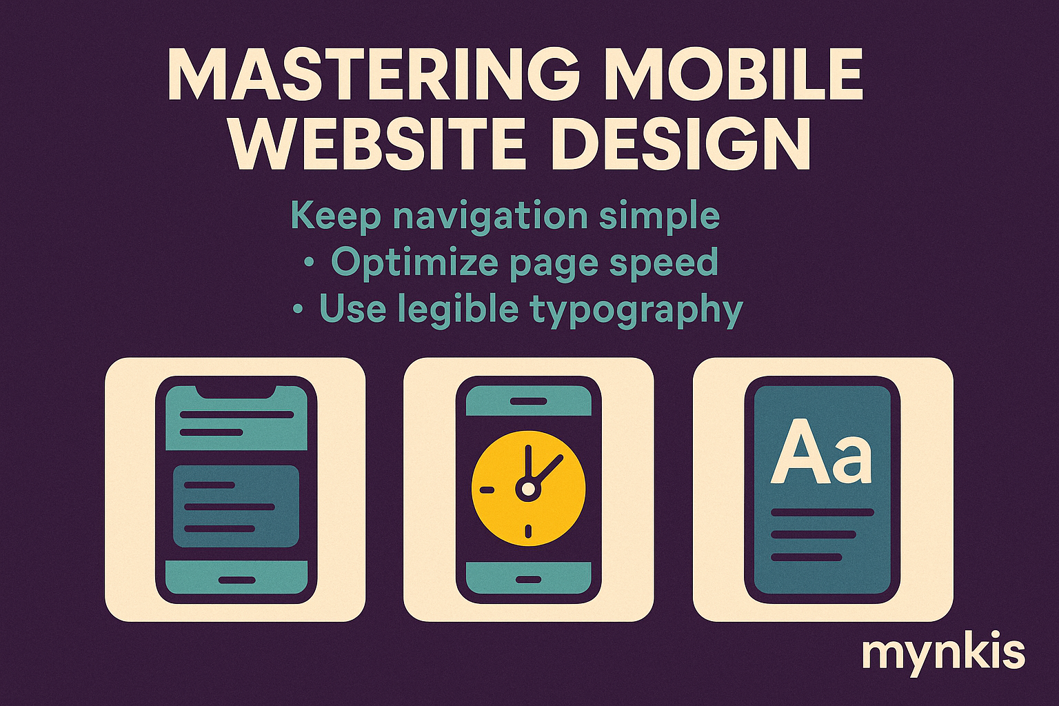
Let's dive straight into an important distinction: responsive design versus mobile-first design. As I've worked closely with clients on their custom software development projects, I can confidently say that while both approaches aim for cross-device usability, the mobile-first mindset often yields superior results for mobile users. Responsive design allows content to adjust across all devices, a necessity given the diverse user landscape. Yet, a mobile-first design goes further by designing for the smallest screens first, guaranteeing that content prioritization serves mobile users effectively. Personal experience shows me that practices with a strong mobile presence using this approach report higher client satisfaction rates and better SEO performance for their enterprise web solutions.
The menu might be a common feature, but on mobile devices, it requires a specialized approach. In practice, what's worked wonders for us is opting for a streamlined, often accordion-style menu that provides easy access without overwhelming the user. It's about making it effortless for potential clients to navigate to what matters most—your services, about page, and contact information, showcasing your expertise in a way that feels accessible on a small screen.
Speed is more than a convenience; it's a necessity on mobile. From what I've seen, users are quick to abandon a site if it doesn't load within seconds. According to Google, as supported by their comprehensive research into enterprise web solutions, a one-second delay can impact conversion rates by up to 7%. For practices, this means losing out on potential clients due to a laggy, slow-loading website.
I recall working on a dental practice's website where enhancing typography was the key to better mobile engagement. It made me realize the importance of readability in attracting and retaining clients on mobile devices. Type should be large enough to be easily legible without zooming, yet not so large as to distort the overall aesthetic of your enterprise web solution. At the same time, contrast between text and background must be high, ensuring that even in bright sunlight, your site's professionalism shines through.
I've often found that practices can get caught up in the content of their sites, neglecting the fact that mobile users interact through touch. By now, you might have guessed that touch-friendly interfaces aren't just a trend—they're a requirement. Buttons and links need to be sufficiently large to tap, with enough space between them to avoid mistakes. Plus, given my encounters with clients who had issues with scrollable areas, I strongly advocate ensuring they're designed to glide smoothly, preventing user frustration.
In developing client-focused websites through custom software development, there's a critical need to prioritize content visibility on smaller screens. Consider that your potential clients might be scrolling through their phones at a coffee shop or during a commute. Now, imagining their journey through your site should you opt for a minimalist design with ample white space? It's about making sure that key messages about your expertise or services are immediately visible without the need for endless scrolling—a strategic move that has proved beneficial for SEO in practice.
Engaging visuals can tell your practice's story better than text, but on mobile, they can be a double-edged sword. Using my insider's eye, I've overseen situations where oversized images slowed down sites to a crawl, deterring potential clients. Aim for images that have been specifically optimized for smaller screens and quicker load times, with alternatives like SVGs for logos where necessary. It's a way to ensure your professional image is communicated effectively.
Mobile SEO is crucial for practices wanting to make their mark online, and it's rooted in the user experience. From what I've seen, structured data, fast-loading sites, and mobile-friendly URLs are all part of enhancing SEO. According to a Google report on digital strategies for enterprise solutions, by focusing on these elements, your practice can improve its search engine ranking, helping attract clients more efficiently.
When I delve into user engagement through website design, there's a clear lesson about forms and Calls To Action (CTAs) on mobile devices. They should be concise, simple, and optimized for completion on small screens. For instance, practices with easily fillable forms report better client follow-through. Avoid over-complicated multi-step processes—instead, think clean, straightforward, and user-friendly.
The concept of continuous improvement through testing and iteration has proven indispensable to several clients in refining their mobile interfaces. Start by testing your site on real devices, as emulators only go so far. Based on my work with them, I recommend adopting a culture of A/B testing for various design elements, iterating based on real user behavior data to refine the user experience. It's a refined approach to ensure your site continually meets the ever-evolving demands of today's mobile users.
I have seen a distinct shift towards not just meeting but exceeding ADA standards on mobile websites—a trend influenced by insights from the National Institutes of Health on digital accessibility. By incorporating alt text, clear navigation, and easy-to-understand CTA buttons into your practice's site, you cater to a broader audience, potentially increasing your client base and reflecting the level of care expected from a modern practice.
Analytics act as the guiding light in enhancing mobile user experiences for any practice looking to up its game. Insights into how clients interact with your site, directly through engagement data on heat maps and conversion paths, can drive decision-making. By deeply analyzing these metrics, your mobile website strategy, buttressed by targeted custom software development, evolves to better serve current and prospective clients.
The design of your mobile site can significantly influence trust among potential clients. A cohesive, well-thought-out mobile design reassures users that they've come to the right place for professional services. When coupled with transparency about user data privacy and a commitment to ongoing support, it creates a powerful framework. I've watched how practices that adopt a user-centric design approach have not just achieved better engagement but also instill greater client trust—an essential component in today's mobile-centric world.