Schedule a Demo
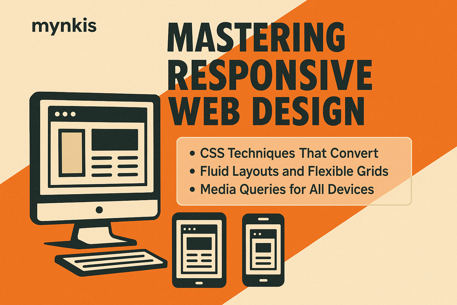
When I guide my clients through the journey of crafting their booking-enabled websites, I've learned that flexibility in design isn't just a perk—it's fundamental. A responsive website that adapts seamlessly across devices not only enhances user experience but also crucially boosts conversion rates. Today, more than ever, it's imperative that website owners harness CSS techniques tailored to responsive development to engage users and achieve greater visibility on organic searches.
I've often witnessed businesses pondering over the complexities of making their site function flawlessly on any device. Enter fluid grids—a straightforward yet powerful solution that allows your layout to shift and realign based on the user's screen size. By using percentages instead of fixed pixel values, elements on your page grow or shrink, preserving the proportions no matter the viewport. This ensures that your booking system remains accessible and intuitive, whether viewed on a desktop, tablet, or smartphone.
I've seen, time and again, how media queries can serve as the cornerstone of personalization in website design. They permit you to apply different styles depending on the characteristics of the device or screen. For owners keen on optimizing conversions, adjusting the layout of a booking form based on the device can mean the difference between a completed or an abandoned transaction.
Integrating Flexbox into your CSS arsenal can drastically simplify the process of creating flexible and responsive booking page layouts. Its ability to distribute space and align content dynamically within a container is invaluable. Picture a gallery of available timeslots adjusting to the user's screen without additional scripts or hacks—this is the level of user-centered design that modern websites demand and CSS Flexbox delivers with elegance.
I always encourage my clients to explore CSS Grid for its powerful two-dimensional layout capabilities. As opposed to just aligning items in a single direction, like Flexbox does, Grid allows for a more intuitive arrangement of content on your site—critical for displaying an array of booking options in a clear, understandable manner.
When I delve into responsive design, one area I particularly focus on is handling images effectively. Slow-loading images can deter potential bookers who are in a hurry. With CSS, you can control image sizing and resolution through attributes like `srcset` and `sizes`. Ensuring images scale correctly with the browser's width accelerates load times and keeps your user engaged, increasing the likelihood of booking completions.
In my experience, using CSS variables significantly enhances the maintainability of a responsive site. They allow you to manage styles more efficiently across different screen sizes. Change a variable once, and watch as your booking buttons adjust their color, or your font scales consistently across the board—streamlining the iterative process of fine-tuning your site for conversions.
A mobile-first approach shifts the paradigm from scaling down to building up for larger screens. It ensures that the critical elements—your booking system—in the mobile version are given priority. This concept, which I've embraced in my responsive design philosophies, aligns with the way consumers increasingly access websites on their handheld devices.
With the prevalence of high-resolution displays, it's more important than ever to consider how your responsive design holds up. The art here lies in providing crisp images and interfaces without bloating load times. CSS techniques can help in delivering different image sources tailored to different device resolutions, securing the clarity and professional appearance essential for instilling trust and encouraging bookings.
I firmly believe that an inclusive web design that factors in accessibility goes beyond a moral imperative—it enhances usability for everyone. By utilizing CSS properties such as `media queries` for various user agents and `rem` units for scalable typography, you assure that your site, including its booking functionalities, is accessible to users with diverse needs and devices.
From my experience, performance directly influences conversion. A booking-enabled website must load swiftly to avoid user frustration. Strategies like CSS optimization, such as minification and critical CSS, can drastically improve the loading times of responsive pages, keeping users engaged from start to finish.
Delving into CSS transitions and animations can elevate your website's user experience to new heights. Subtle movements that guide users through the booking process foster a more interactive and engaging journey. They can enhance the perceived responsiveness of your site, contributing to higher user retention and completion rates.
A technique I've found to be nearly indispensable is progressive enhancement. Starting with a solid, semantic HTML foundation and layering on CSS and then JavaScript incrementally ensures that all users, regardless of their browsing technology, can engage with your booking services. This approach is at the heart of delivering a universally accessible and responsive site that will be appreciated by all.
When considering responsive design, don't overlook the importance of navigation. A well-structured, device-adaptive menu, achieved through CSS, can lead your users seamlessly to your booking page. Enhanced navigation improves user flow, limiting abandonment at critical decision points on your site.
Search engines like Google prioritize mobile-friendly sites in their rankings. By leveraging the CSS techniques that create responsive, booking-enabled designs, you directly affect your site's SEO. Proper structuring with semantic elements and optimized CSS leads to enhanced user engagement signals—like reduced bounce rates—that positively influence your organic search performance, driving more traffic to your booking page.