Schedule a Demo
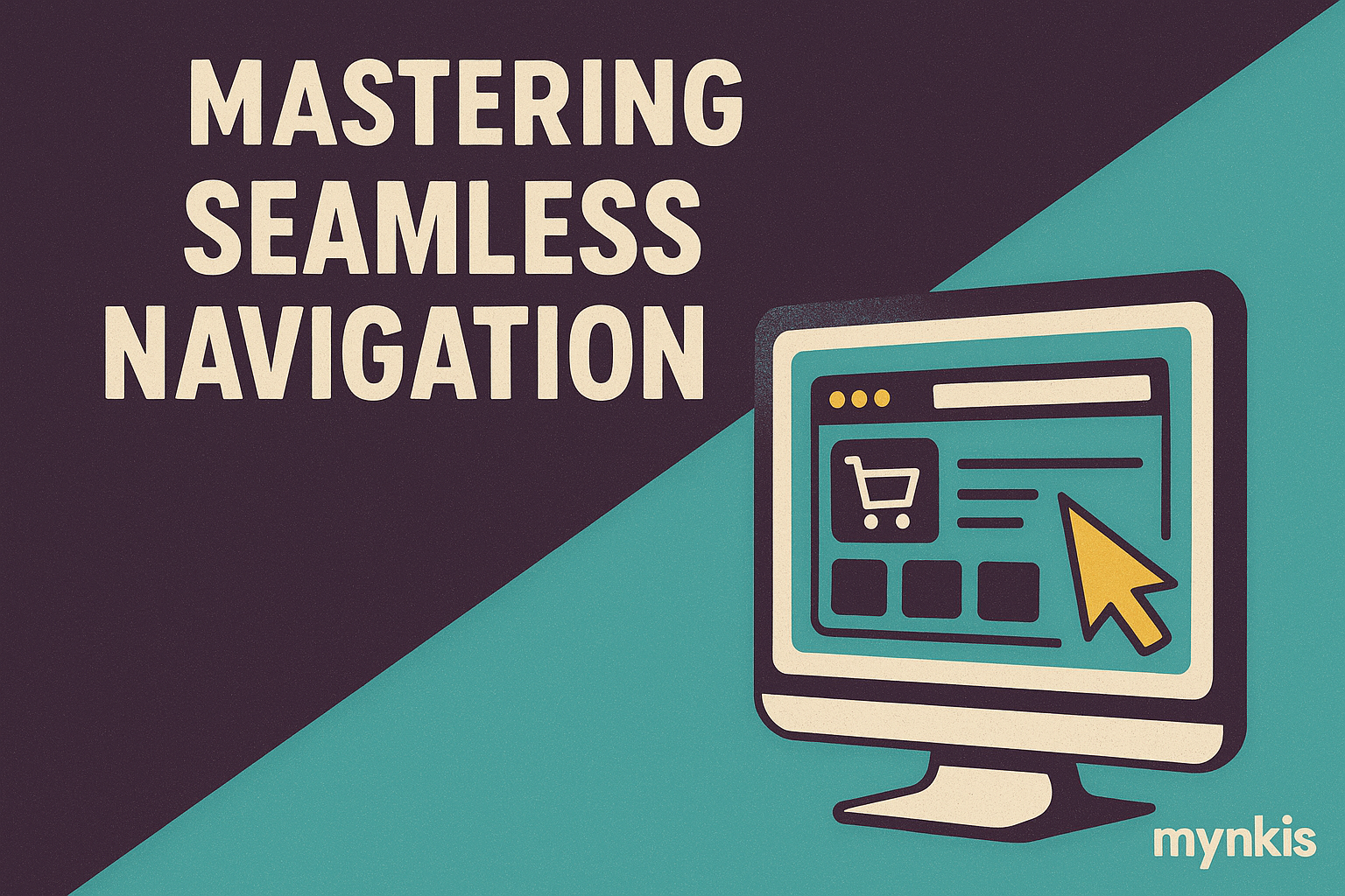
Navigation isn't just a feature; it's the backbone of every online store, guiding visitors effortlessly from product discovery to checkout. In my work with various retailers, I've seen how a well-crafted navigation can significantly boost user engagement and sales. Robust navigation lays the foundation for an intuitive user experience, turning casual browsers into loyal customers. Imagine a customer browsing your store; they're looking for that perfect item, but if the site is confusing, they'll leave. It's not just about aesthetics; it's about crafting an experience where shoppers feel confident and in control. Based on extensive user data, up to 39% of users will stop engaging with a website if navigation and content are not well organized, highlighting the necessity of flawless navigation in today's online retail world.
Effective navigation isn't about throwing every link onto the page; it's about selective, strategic placement. Clarity and simplicity must guide your choices—users need to understand where they are at all times. Use clear, descriptive labels; don't just name your categories, but narrate the experience. For example, rather than simply 'Clothing,' a more engaging title might be 'Explore Our Latest Fashion Arrivals.' This gives users a sense of what they will encounter without overwhelming them with choice. I find that in my work with clients, those who take time to thoughtfully design their navigation increase user satisfaction tremendously.
While menu navigation is crucial, an efficient, robust search function acts as its invaluable partner. It’s especially useful in larger stores where customers have specific products in mind. Search must be intuitive, suggesting terms and autocompleting to streamline the shopping process. The big guns like Amazon and Google set high standards in search functionality, hinting at what users expect even from smaller online retailers. In my experience, integrating a powerful search tool reduces frustration and, more importantly, increases conversion rates by ensuring users find what they need quickly and efficiently.
Resist the temptation to pack your homepage with every possible navigation option. The more options you give, the harder it is for the user to make a decision. Aim for a clean, simple top-level menu that offers the main categories, while giving users additional layers to explore deeper content. In my interactions with clients, retailers who opt for less cluttered navigation tend to see improved engagement rates. Keep it straightforward; your customers will thank you for it, and your analytics will reflect their gratitude.
In today’s world, where nearly half of e-commerce transactions occur on mobile devices, your navigation must be as effective on a smartphone as it is on a desktop. A responsive design ensures your navigation adapts seamlessly, using a hamburger menu for smaller screens when necessary without losing functionality. From my collaborations with different businesses, a consistently smooth experience across devices directly impacts customer loyalty and, ultimately, your bottom line.
Breadcrumbs might seem old-fashioned, but they offer unparalleled value in helping users understand their path within your site. Displayed under the page's primary navigation, they give users clear guidance on where they are and how to get back to previous levels. In implementing breadcrumbs on client websites, I've seen them contribute to a decrease in the bounce rate and an increase in the average session duration, proving their worth.
Navigation isn't just about getting from point A to B; it's about guiding the user's journey. The psychology behind navigational elements like hover menus and dropdowns influences the user's decision-making process. Colors, icons, and even placement on the page all play crucial roles. For instance, using bright colors for calls to action can guide users towards conversions, while placing your logo on the top left leverages familiar conventions, assuring users of the site's stability and structure. Based on my observations, subtle psychological cues integrated into navigation designs can significantly enhance user experience.
While the primary function of navigation is usability, overlooking its potential SEO benefits would be a missed opportunity. Links in your navigation bar are internal links that help search engines understand your site structure, boosting its SEO. However, keep them flat and shallow; three levels deep is often ideal for user experience as well as for SEO optimization. Including keywords in your navigation links can also help, provided they align naturally with your category titles.
Designing your navigation isn’t a set-it-and-forget-it affair. It requires ongoing testing and iteration. Tools like heatmaps and user session recordings can show you how users interact with your site, revealing where improvements are needed. From A/B testing different layouts to gathering user feedback, the process should be continuous. In working with several retail clients, the ones who committed to this iterative process found significant enhancements in user metrics, confirming its importance.
Imagine a navigation that adapts to each visitor based on their past behavior or preferences—what a powerful tool for enhancing user experience and driving conversions. Technologies allowing for personalized navigation can transform an average online store into an intuitive, engaging shopping destination. Based on my experiences with retail partners, implementing personalized navigation resulted in increased return visits and higher basket values, a testament to the power of tailored user experiences.
It's easy to fall into common navigation pitfalls—overwhelming the user with too many options or using unclear labels. Hidden menus or requiring multiple clicks to access content can be particularly frustrating. In ensuring you sidestep these traps, take the time to regularly audit your navigation structure. User tests, especially those involving actual customers or potential buyers, can help identify issues you might not see yourself. This attention to detail helps create a navigation experience that feels intuitive and user-centered.
The key to perfecting your website's navigation isn't just in the data; it's in the voices of your customers. Encourage feedback through surveys or direct communication channels. Listening to your audience is perhaps the most effective way to ensure your navigation evolves to meet their needs. For instance, a frequent criticism might lead you to refine your search functionality or streamline your category structure. Integrating customer insights not only improves your navigation but demonstrates to customers that their voices shape your business.
The digital landscape evolves constantly, and your navigation must adapt with it. Keep an eye on emerging trends in custom software development and enterprise web solutions, learning from industry leaders like IBM or Google to refine your own practices. Tracking best practices and staying informed means you're always one step ahead, creating an online experience that customers value and that aligns with the dynamic nature of modern retail. It's about continuous learning, adaptation, and the readiness to embrace the new while retaining what works.