Schedule a Demo
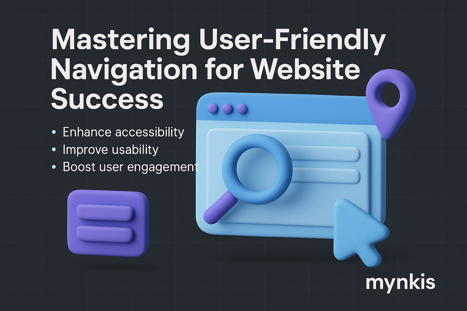
Effective navigation on a website is the backbone of user experience, guiding visitors effortlessly through your digital space. In my work with operations managers, I've seen how a well-crafted navigation system can dramatically improve user retention and lead generation, particularly important for firms needing robust B2B websites designed for SEO-driven lead acquisition. By simplifying access to your services and information, navigation not only enhances user satisfaction but also boosts your search engine rankings.
At its core, good navigation adheres to principles of clarity, consistency, and accessibility. Clarity means labeling menu items in plain, descriptive language that instantly informs users of what they'll find by clicking each tab. Consistency ensures that navigational elements maintain the same look and functionality across different pages, fostering a reliable user experience. Accessibility, meanwhile, takes into account the varying needs of all users, ensuring that navigation is straightforward for everyone, including those with disabilities.
Creating a navigation that feels intuitive starts with a deep understanding of your audience. I often recommend businesses conduct user research to see how different types of visitors navigate a site. For B2B clients, you might find your users want quick access to technical specifications or case studies. Use this information to structure your navigation to prioritize these high-demand sections, ensuring they're easily reachable from the main menu. As Bill Buxton, a renowned designer, stated, 'You can’t just open the doors and expect people to wander in.' Navigation must guide them directly to what they seek.
While each website is unique, certain elements are universal across successful navigation designs. A horizontal top menu serves as the primary guide, typically containing 5 to 7 major sections to prevent cognitive overload. Additionally, a sidebar menu for secondary navigation can further organize specific areas of your site, such as resources or support sections. Incorporating a breadcrumb trail helps orient users, showing their current position relative to the site's structure. Lastly, a well-implemented search function can be the safety net for those who can't find what they're looking for via conventional means.
With the increasing prevalence of mobile devices in B2B transactions, ensuring your navigation remains user-friendly on smaller screens is non-negotiable. In my experience working with firms investing in SEO-friendly B2B websites, I've found that mobile responsiveness significantly impacts user engagement and conversion rates. Strategies include using larger touch targets for navigation links, implementing a 'hamburger' menu for a cleaner interface, and reducing the depth of your menu to make navigation quicker. Being mindful of thumb reach, the 'most accessible zone' on a mobile screen, can also guide where you place critical navigational elements.
SEO isn't just about content; it's about the entire user journey, including how you structure your site's navigation. I advise business leaders to structure their menu to reflect their target keywords and service offerings directly, enhancing the site's relevance in search results. Furthermore, a clear hierarchy can boost your site's SEO as search engines reward sites that provide a logical, easy-to-navigate experience for users. According to Moz, a leading SEO authority, site architecture has a significant impact on search rankings.
Analytics play a crucial role in understanding how your audience navigates your site. Tools like Google Analytics or Hotjar can provide insights into user behavior, from heat maps showing where users click most often to tracking drop-off rates at specific pages. Analyzing these patterns can reveal weaknesses in your current navigation structure, guiding you to make data-driven improvements. I often emphasize to my clients that, although based on available research, the performance of your navigation can vary, but analytics offers the clearest path forward.
Not all visitors approach your site with the same needs or intentions. For instance, new visitors might need more guidance, benefiting from highlighted key navigation items or a tutorial upon first visit. In contrast, returning users might benefit from recent activity menus or personalized suggestions in the navigation bar. Designing your navigation to cater to these different segments can make your website more approachable and user-friendly.
The perfect navigation isn't achieved on the first try; it's refined through testing and feedback. I suggest using usability testing sessions where real users navigate through your site while you observe. This hands-on approach provides invaluable insights into how your navigation is performing. Be prepared to iterate and adjust based on user feedback, and don't shy away from making significant changes if they lead to a better user experience. Remember, as Jakob Nielsen, a pioneer in user experience design, posits, 'User experience encompasses all aspects of the end-user's interaction with the company.'
A recent project I led at a tech firm exemplifies the power of redesigning navigation for better results. We restructured the main menu to focus on service categories most frequented by their B2B audience. A secondary menu directed visitors to recent case studies and technical information, which had previously been buried deep within the site. Post-launch analytics showed a 27% increase in page visits to these areas, and lead generation via the site saw a substantial uptick. This case underscores how intentional navigation design contributes directly to business outcomes.
As business needs evolve and web technology advances, ensuring your navigation remains relevant is critical. Anticipating future changes in your services or content can guide you in designing a flexible navigation structure. I often counsel clients to build navigation systems with room for growth and modifications, avoiding rigid systems that could become obsolete. Adapting to new trends, such as voice search integration, can keep your navigation system contemporary and user-centric.
Designing a stellar navigation system often requires the insight of professionals who can bring specialized knowledge and experience to the table. When your site's performance dictates a major navigation overhaul or when expanding your digital presence with SEO-driven integration and automation tools, consulting with experts can ensure your approach is comprehensive. While this article provides strategies and principles to enhance navigation, certain complexities, such as detailed user testing or deep integration of SEO practices, might necessitate professional guidance.
The way you structure your site's navigation sends a clear message about your brand. A streamlined, user-friendly interface can elevate the perception of your firm as efficient and customer-centric. Conversely, a convoluted or unintuitive navigation system might suggest oversight or a lack of attention to user experience. I've learned from industry leaders like Don Norman that every detail in user interface design reflects on the brand's commitment to excellence.
Mastering user-friendly navigation is an evolving task, blending art, science, and continual refinement. By aligning your navigation strategy with principles of clarity, user research, and SEO best practices, your website can transform from a digital presence into a dynamic tool driving business growth. Regularly reviewing and updating your navigation keeps it aligned with user behavior, helping your site stand out in the crowded digital marketplace of B2B engagements.