Schedule a Demo
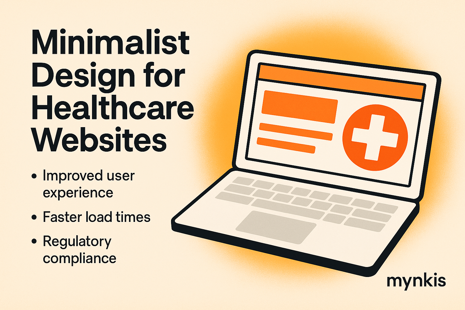
In my work with healthcare providers, I've seen firsthand the transformative impact a well-designed website can have. When clinics and hospitals implement a minimalist design approach, it's not just about aesthetics; it's about enhancing usability, boosting engagement, and ensuring compliance with healthcare standards. From my experience, here's how minimalist design ideas can revolutionize the way medical professionals interact with their patients online.
The navigation of a healthcare website should be intuitive, minimizing the effort required for patients to find what they need. A minimalist design with a clear, uncluttered menu enhances usability. For instance, grouping services under broad categories such as "Patient Services," "About Us," and "Contact" can streamline the user journey. Based on available research, well-organized menus can reduce bounce rates and encourage longer sessions, crucial for patient engagement and education.
When designing a healthcare website, prioritizing the most important information ensures patients can quickly access essential details. A minimalist approach encourages placing critical elements like appointment booking, emergency contacts, and location maps prominently at the top or center of the page. This not only aids in compliance with accessibility standards but also aligns with healthcare's core focus: patient care. I've noticed that sites like Mayo Clinic employ this strategy, effectively balancing informativeness with user-centered design.
White space isn't just empty space; it's a crucial element of minimalist design that enhances readability and focus. In healthcare websites, effective use of white space around text and images can direct the patient's attention to essential features like symptom checkers or telehealth links. It's vital to remember that while white space creates a calm and focused user experience, it should also be balanced to avoid any sense of emptiness or confusion, which can deter patients seeking urgent information.
Color choices in minimalist design go beyond aesthetics; they are essential for branding and emotional impact. In healthcare, colors should convey trust and professionalism. Subtle tones of blue, green, or grey can evoke a sense of calm and reliability. The American Medical Association, for instance, uses these colors to strengthen their brand identity. However, it's crucial to ensure colors meet WCAG guidelines to provide a comfortable experience for all users, particularly those with visual impairments.
Typography in healthcare websites should be clear and easy to read, aiding both general users and those with visual impairments. A minimalist design approach often uses sans-serif fonts like Arial or Helvetica, known for their readability on screens. Organizing content through typographical hierarchy—with larger headings for sections and smaller text for details—facilitates quick scanning and improves overall usability. It's amazing how these small changes can make a massive difference in patient communication and engagement.
Compliance with healthcare regulations, such as HIPAA, is non-negotiable when designing patient portals and data management systems. A minimalist design approach can assist in this by offering a straightforward and secure interface for data entry. Ensuring that forms are easy to navigate, with clear labels and intuitive error messaging, not only improves user experience but also streamlines data handling for healthcare professionals. It's fascinating to see how design and compliance can work hand in hand.
Mobile optimization is crucial in healthcare due to patients' increasing reliance on smartphones for health-related inquiries. A minimalist design inherently lends itself well to smaller screens by prioritizing essential content and ensuring a responsive layout. I've witnessed time and again that when medical facilities design their sites with mobile-first principles, it results in better engagement rates and more satisfied patients who can access critical information anytime, anywhere.
Visuals are key in conveying medical information quickly and effectively, but in a minimalist design, balance is key. Using high-quality, relevant images—like illustrations of medical procedures or health conditions—without overwhelming the viewer enhances both the aesthetic and informative value of the site. Considering sites like WebMD, they manage to maintain simplicity while still providing visual guides. Remember, individual results may vary, and the success of such designs depends on context and user needs.
Accessibility should be a priority for any healthcare website design. A minimalist approach, when done right, can lead to more accessible websites that cater to diverse user needs. Ensuring sufficient contrast ratios, readable fonts, and easy-to-navigate layouts can help. According to the World Wide Web Consortium (W3C), these elements play a significant role in meeting WCAG guidelines. It's not just about law compliance; it's about inclusivity in healthcare.
Healthcare websites must be fast and reliable to provide timely information to patients, especially in emergencies. Minimalist design can significantly boost site speed by reducing the number of elements and optimizing images and code. In my experience, patients often leave a site if it takes too long to load, underscoring the importance of a streamlined approach. This optimization can improve patient experience and search engine rankings, benefiting the healthcare institution on multiple fronts.
The work doesn't end once a minimalist website goes live. Continuous monitoring and user feedback are essential for iterative design improvements. Tools like Google Analytics can help track how patients interact with the site and where they encounter difficulties. While some elements of design work well universally, others might need tweaking based on specific user feedback or emerging trends in healthcare. Ensuring that a website evolves with user needs is vital for sustained engagement and effectiveness.
Looking ahead, the integration of AI in minimalist healthcare websites could revolutionize patient interaction further. From chatbots providing instant responses to health queries to AI-driven recommendations for personalized medical advice, the possibilities are endless. As healthcare institutions embrace these technologies, it's essential to maintain the minimalist design ethos—simple, clean interfaces that enhance rather than complicate the user experience. Embracing AI in this way respects the fundamental principles of minimalist design while pushing healthcare into the future.
Implementing a minimalist design approach in healthcare websites isn't just a trend; it's a strategic move towards enhancing user engagement and efficiency. From simplifying navigation to ensuring accessibility and speed, every aspect must align with the goal of delivering better patient care. My time working with healthcare providers has shown me that when done correctly, these designs not only improve functionality but also elevate the organization's image, fostering greater trust and reliability among patients. Considering the fast-paced nature of healthcare, embracing minimalism makes perfect sense.