Schedule a Demo
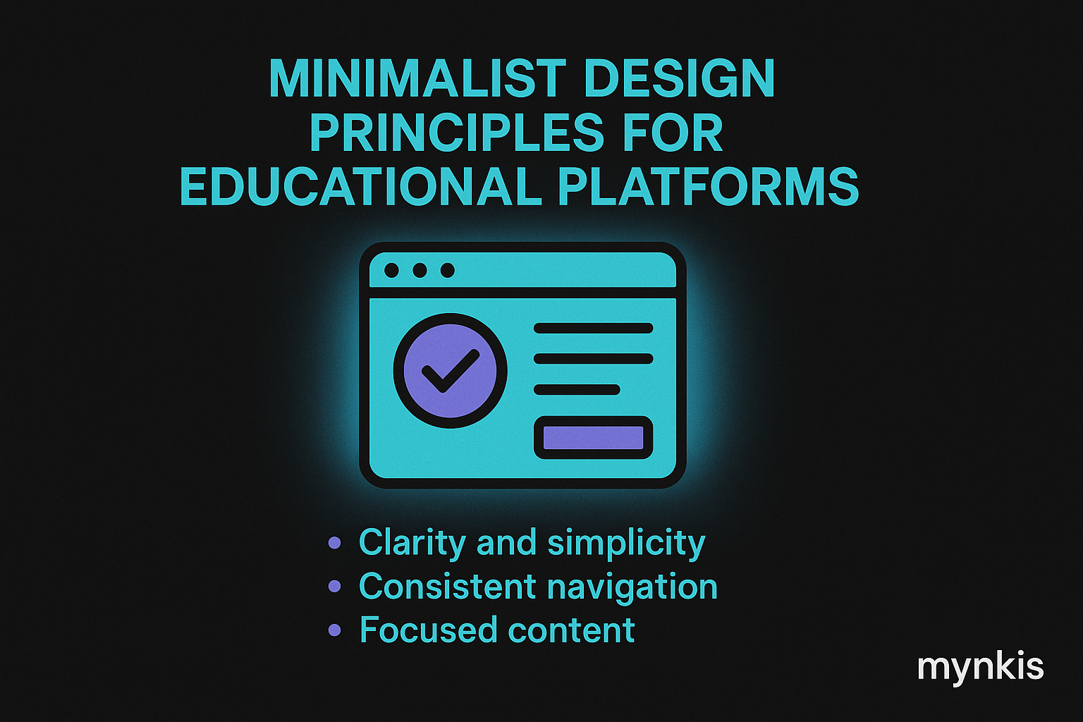
Minimalist design, when applied to educational platforms, can dramatically enhance user experience and learning outcomes. In my work with schools and universities, I've observed how a streamlined interface reduces cognitive load on students and educators alike, allowing them to focus purely on the educational content. The essence of minimalism in education is not just about less clutter but about creating an environment that supports seamless navigation and interaction.
The psychological impact of minimalist design in learning management systems cannot be overstated. Clutter-free environments help reduce stress and increase concentration, which is essential for both students and teachers immersed in digital learning. From my experience working with educational institutions, there's a clear correlation between clean, focused design and higher student engagement and retention rates.
At the heart of a minimalist website for education are clear, uncluttered layouts. This involves using whitespace effectively to guide the user's eyes through the page effortlessly. In the realm of custom learning management systems, intuitive navigation and straightforward menus are key to ensuring that all users can access the material they need without frustration. Moreover, simplicity in design fosters accessibility, making your platform usable for a wider audience, including those with different abilities or tech-savviness levels.
When developing a custom learning management system, the challenge is to incorporate minimalist design principles without sacrificing functionality. This can be achieved by focusing on what's truly essential for learning. For example, limit the color palette to reduce visual noise, choose clean, modern fonts, and ensure that any interactive elements like buttons or menus are visually harmonious and easily clickable. This balance between design and usability is critical for creating an effective educational tool.
Optimizing a minimalist education website for search engines like Google goes beyond aesthetics. It's about delivering value to users swiftly and effectively. By structuring your content with clear headings (
Several institutions have successfully adopted minimalist design in their learning platforms. For instance, a university might opt for a homepage with a clean grid layout featuring clear entry points to key sections like 'Courses', 'Resources', and 'Support'. Another example is a school using large, compelling visuals with overlaid text to direct users to primary actions such as registration or login, thereby keeping the user interface clean and focused on user goals.
Implementing minimalist design in custom learning management systems comes with its set of challenges. One primary concern is ensuring that the reduction of elements doesn't impede the essential functions needed by students and educators. It's a delicate balance between aesthetics and functionality; every design choice must be thoroughly vetted against educational objectives. Additionally, institutions must consider the diverse needs of their users, which might require adaptable design solutions.
User feedback is invaluable in refining minimalist designs for educational platforms. Institutions should actively collect insights from both students and faculty to understand what works and what can be improved. This iterative process helps ensure the design remains true to the principles of minimalism while addressing the real-world needs of its users.
As technology evolves, so does the approach to minimalist design in educational settings. The future points towards more personalized and adaptable learning platforms, yet with minimalism at their core. The challenge for schools and universities will be to embrace cutting-edge technology, like AI and virtual reality, while maintaining the elegance and focus that minimalism brings to the learning experience.
One way to increase engagement through minimalist design is to prioritize interactive elements strategically. Rather than bombarding users with overwhelming choices, direct their focus to key activities such as participating in forums or submitting assignments. This deliberate placement of interactive elements can lead to higher student engagement because the paths to participation are clear and unobstructed.
Accessibility should always be at the forefront of any educational website or LMS design. Minimalist design can enhance accessibility by removing extraneous distractions and creating a clear path for interaction. However, it's essential to ensure that this approach to design also accommodates various accessibility needs, including compliance with guidelines like the Web Content Accessibility Guidelines (WCAG).
A minimalist design doesn't mean a bland palette. Instead, choosing the right colors can enhance the learning experience. Soft and neutral colors can create a calming backdrop to educational content, while vibrant accents can highlight important information or calls to action. The key is to maintain visual harmony that supports, rather than competes with, the educational material.
Typography plays a crucial role in any minimalist design. For education platforms, the choice of fonts can affect readability and the overall user experience. Sans-serif fonts like Helvetica or Arial often complement minimalist designs well, as they are highly readable and have a modern aesthetic. However, the challenge is to choose a typographic system that not only reflects minimalism but also meets the diverse needs of an educational audience.
In an age where learning happens on multiple devices, responsive design is essential. Minimalist design principles mesh well with responsive design, ensuring that the user experience remains seamless across devices—from desktops to smartphones. A well-implemented responsive design keeps the core minimalist elements front and center, regardless of how or where students access the learning platform.