Schedule a Demo
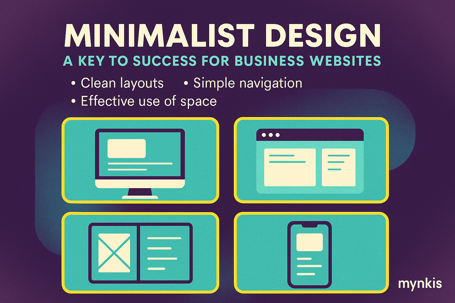
In my work with various operations managers, I've observed a growing trend towards simplicity in web design, particularly within firms looking to enhance their online integrations and lead generation. Minimalist website design isn't just about stripping away the excess; it's about focusing on what truly matters to drive engagement and conversions. This approach aligns perfectly with the needs of businesses seeking efficient automation software and B2B websites that prioritize SEO-driven lead generation.
The concept of minimalism in web design revolves around the principle of less is more. By eliminating clutter, businesses can guide their visitors more effectively towards the core message or action they want to emphasize. According to a study by Google, a website's simplicity can reduce bounce rates significantly, allowing for longer visitor sessions and, potentially, higher conversion rates. This is essential for companies utilizing automation to streamline their processes and for those wanting to harness SEO strategies to improve lead generation.
White space, or negative space, is a cornerstone of minimalist design. It's not merely empty space; it's an active element that improves readability, draws attention to key content, and provides a canvas that elevates the overall user experience. For businesses in the B2B sector, especially those integrating automation solutions and aiming to generate leads through SEO, white space can help focus visitors on essential information, reducing the cognitive load and making the navigation through complex integrations and services more intuitive.
Think of white space as the breathing room in your website layout. Based on available research, users tend to perceive websites with ample white space as more professional and easier to engage with. This perception is critical for firms aiming to build trust and authority with their online presence. Whether you're introducing a new integration tool or showcasing case studies of your SEO-led lead generation success, the effective use of white space can subtly enhance these elements' impact on your audience.
Complex websites with deep navigation menus can be a deterrent, especially for potential clients looking for quick answers or easy access to contact forms. A minimalist approach to navigation means fewer options but with a stronger, clearer path to vital information and conversion points. In the world of custom software development, clarity in navigation can make a world of difference in how easily clients can find and understand the automation solutions you offer.
Consider implementing a simple, clean menu with categories directly related to key areas of your business, such as integrations, services, or case studies. This strategy is backed by the principles of human-centered design, which focuses on reducing user friction and enhancing experience through simplicity. For businesses aiming for enterprise web solutions that support lead generation, effective and minimalist navigation ensures that the journey from landing page to lead form is as straightforward as possible.
Typography plays a pivotal role in minimalist design. Using clean, readable fonts helps in communicating your message effectively without distraction. For example, a well-selected typeface can convey your brand's professionalism and commitment to detail, which is vital for businesses in the custom software development sector. It's not just about aesthetics; it's about functionality, ensuring that your audience can absorb the key points quickly, aiding in better lead generation through SEO-driven content.
When working on projects focused on automation and integrations, I've seen how choosing the right typography can make complex information appear more digestible. However, individual results may vary depending on the specific industry and target audience. The best practice here involves testing different fonts to see which resonates most with your users, striking the right balance between design and utility.
Minimalist design often incorporates high-quality visuals to convey complex information swiftly and effectively. In B2B settings, where lead generation through SEO is key, this approach can illustrate the benefits of your services or products, such as advanced integrations or automation tools, in a way that words alone cannot. Utilizing impactful graphics or diagrams can make abstract concepts like software solutions more concrete, thus helping to bridge the gap between technical jargon and business outcomes.
For instance, I've worked with clients who used detailed but minimal infographics to explain their enterprise web solutions. These visual aids help demystify the technical aspects of their offerings, making it easier for prospects to understand the value proposition. To truly engage your audience, select visuals that are not only high-quality but also directly related to your core message or the unique selling points of your service.
Maintaining a consistent brand identity in a minimalist design helps in creating a unified and memorable user experience. This consistency should reflect in your color scheme, logo usage, and overall style. For businesses invested in automation and integrations, this unity extends to the visual representation of these services on your website. Consistent branding assures potential clients of your brand's stability and professionalism, crucial for building trust and attracting leads.
From my experience, a monochromatic color palette used consistently across a website strengthens brand recall. For firms looking to enhance lead generation through SEO, consider aligning your visual elements with your content themes. This holistic approach not only supports user navigation but also reinforces your brand's message throughout the visitor's journey.
In a minimalist design framework, the call to action (CTA) becomes even more crucial. It should be unmistakable and encouraging without overwhelming the user. For businesses seeking to generate leads via SEO, your CTA should be strategically placed, using compelling language that invites action without being pushy. Whether it's inviting visitors to download a white paper on your custom software development or to sign up for a demo of your latest integration tool, the CTA in a minimalist site benefits from the simplicity surrounding it.
In crafting these calls to action, consider the psychology of color and placement. A contrasting color for your CTA button, against a minimalist backdrop, can draw attention effectively. Based on current practices in the field, placing CTAs after compelling content that outlines the benefits of your automation or integration services can significantly boost conversion rates. Ensure that these elements are seamlessly integrated into your website's minimal aesthetic to maintain the overall experience while driving lead generation.