Schedule a Demo
In an era where mobile browsing has surged, prioritizing mobile-first SEO isn't just smart, it's essential. Not everyone comes to your website via a desk-bound monitor; think about the countless hours your potential clients spend scrolling through their smartphones, seeking professional services.
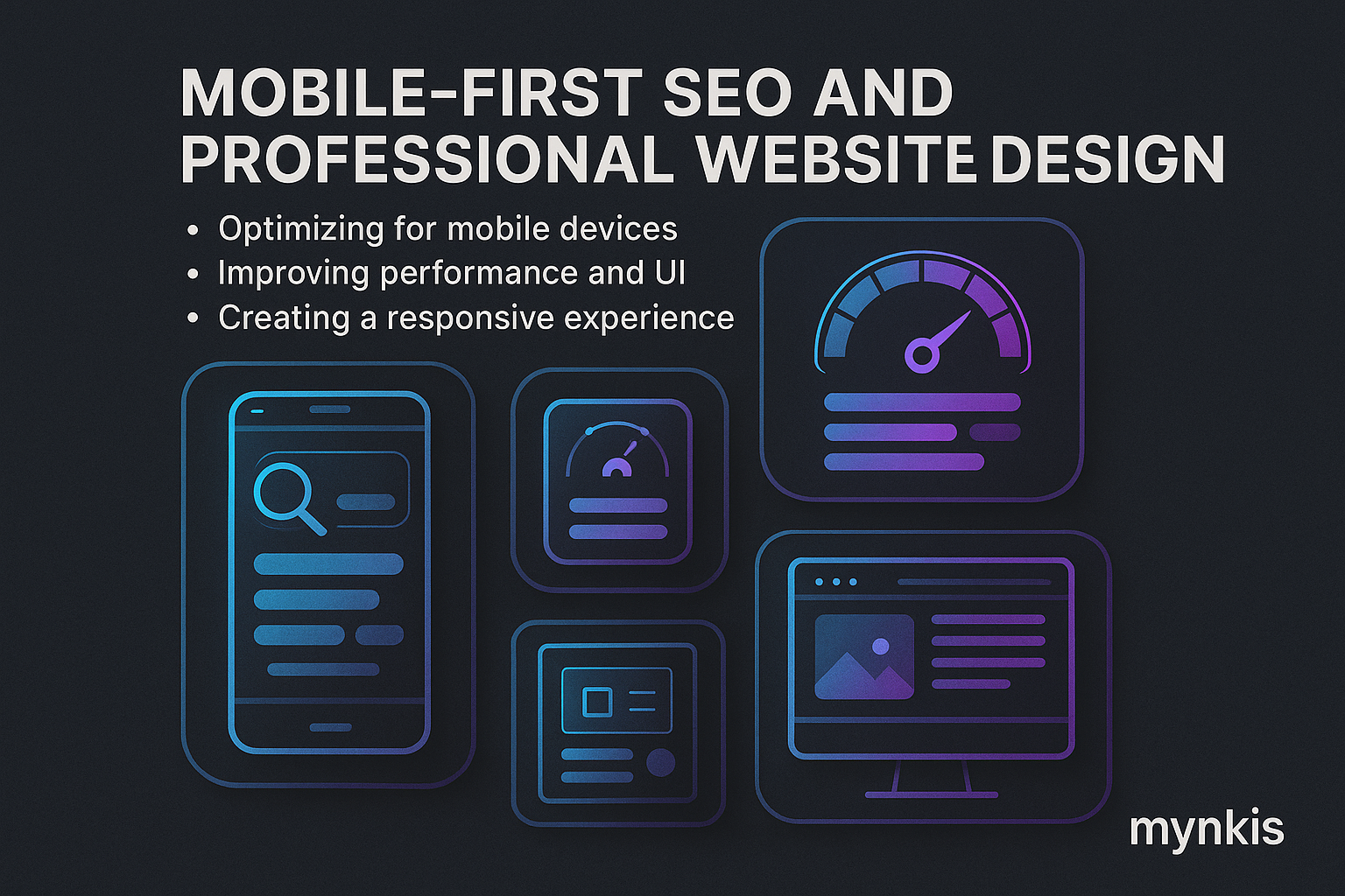
Google's spotlight on mobile-first indexing is undeniable, and the numbers are telling us a story. Studies show that mobile internet traffic surpassed desktop years ago. Given this, if your site doesn’t play nice with mobile devices, you're skipping out on an extensive audience segment. Think of mobile-first SEO as the foundation upon which your website will either thrive or falter.
The expectation for seamless interaction on smartphones has extended to all online spaces, and your practice's site is no exception. Users anticipate fast loading times, effortless navigation, and relevant, easily digestible content. By prioritizing mobile design, not only do you satisfy these expectations, but you also inch closer to those coveted top search rankings.
Mobile-first SEO requires a shift in how we traditionally approach site design and optimization. From the get-go, your design needs to consider the thumb-tapping mobile user, adapting content layout and accessibility so they never have to squint or struggle to find what they're looking for.
Responsive design is our bread and butter here. This isn't a new term if you've dabbled in web development, but understanding its importance has never been more critical. Your website must fluidly shift its form across different device widths without a single pixel of content getting lost in translation.
Speed is not just a convenience; it's a lifeline. The slow load of a page can be the deciding factor between a user sticking around or bouncing over to a competitor's site. To tackle this, consider compressing images, caching content, and leveraging modern web technologies like AMP (Accelerated Mobile Pages) to cut down on load times.
In a world where 'less is more' often rings true, the concise nature of mobile devices demands a radical rethink on content length and style. You wouldn’t recite War and Peace during a thirty-second pitch at a networking event, would you? In the same vein, keep your content tight but value-packed for mobile viewers.
Headings and short paragraphs break the text in a way that feels less intimidating for someone on the move. And let's not overlook local SEO nuances – mobile searchers are often on-the-go, looking for professional services right in their vicinity. Ensure your site's metadata reflects local relevance, because when it does, you boost your visibility in local searches.
The under-the-hood work often goes unnoticed by users, but it's what keeps the search engines smitten with your site. Make sure your site structure is mobile-friendly; that means straightforward navigation and intuitive menu layouts. Technical audits specifically focusing on mobile performance can unearth crucial insights, guiding further optimization efforts.
Considering mobile usability factors like tap targets can prevent the frustration of accidental clicks, propelling user satisfaction. Your URLs should be user-friendly, SEO-optimized, and oh-so mobile. Add in proper structured data, allowing search engines to better understand and display your content in those all-important mobile search results.
In my experience working with operations managers for professional practices, one dentist office took their mobile SEO seriously. They revamped their site with the mobile audience as the priority. Post-launch, not only did their bounce rate plummet, but they also saw an uptick in appointment bookings through their mobile site, illustrating just how effective a well-executed mobile-first strategy can be.
As search engine algorithms evolve, staying current with SEO practices is less about keeping up and more about staying ahead. Websites according to Moz's research, frequently updated with fresh, relevant content are often rewarded by search engines. Embrace tools like Google Analytics and Google Search Console to glean actionable insights from your traffic.
Yet, all these efforts would be for naught if we didn't acknowledge the dynamic nature of this field. The ever-shifting landscape of technology demands that we're agile, rethinking our approach not only at major site updates but continually, to ensure our professional practice's site maintains that competitive edge.
Good old-fashioned trial and error is at the heart of every successful SEO strategy. Set clear objectives around user engagement, organic traffic, and conversion rates. Track your mobile SEO metrics vigilantly, testing and tweaking at every opportunity based on the data at your fingertips.
Personally, what I've learned in bolstering websites for our busy clients is the power of deliberate, data-driven optimization. Not every tweak works as expected, and it's through persistent testing and refinement that success truly emerges.
Mobile-first SEO isn't merely a trend—it's becoming the default, the expectation. Bringing your professional practice's website up to this standard involves investing time and resources now, but it’s an investment that's poised to pay dividends as mobile usage inevitably continues its trajectory upwards.
What's clear to me, after years guiding those helm-like enterprises through the twists and turns of digital evolution, is that a considered, mobile-first approach isn't something you add on to your existing website. It's the mindset from which you build every single webpage moving forward.