Schedule a Demo
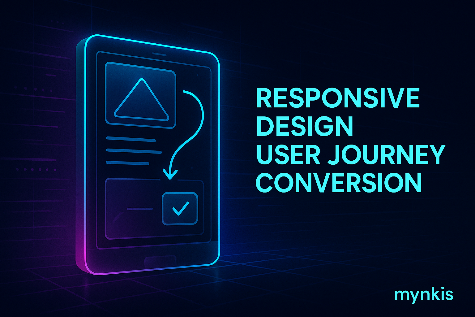
Responsive design is a non-negotiable in today's digital ecosystem. It ensures that your website looks spectacular and functions smoothly on any device, from a smartphone to a desktop. When I work with business owners aiming to increase their user conversion rates, the importance of responsive design becomes crystal clear. Users expect a seamless experience across all their devices, and any disruption can send them running to your competitors. It's not just about aesthetics; it's about maintaining user engagement and ultimately, boosting your conversion rates.
Consider this: Over half of internet traffic now originates from mobile devices. If your site isn't optimized for smartphones and tablets, you're essentially turning away a significant portion of your audience. From my experience, even small businesses that have seen a noticeable uptick in mobile traffic emphasize responsive design to ensure that their potential clients can effortlessly browse and book appointments, irrespective of their device.
Search engine optimization (SEO) is an ever-evolving field, but one constant remains: Google favors websites that offer a superior mobile experience. When I delve into SEO strategies with clients, one key takeaway I stress is the direct correlation between responsive design and improved organic search rankings. A site that's responsive reduces bounce rates and increases dwell time—two metrics Google uses to gauge site quality. Consequently, enhancing user experience can directly improve your organic search visibility.
What used to be a luxury is now a baseline expectation. I’ve seen even the most loyal customers pivot away from brands if their websites aren't optimized for their devices. It’s like dining at a high-end restaurant with gourmet food but wearing outdated, ill-fitting uniforms—customers might appreciate the meal, but their overall experience could leave them feeling let down. For booking-enabled websites, an unintuitive design can lead to lost reservations, particularly for clients who are perpetually on the move.
Let's talk about accessibility. A responsively designed website is a more inclusive platform, catering to the needs of all users, including those with disabilities. In my projects, designing with accessibility in mind enhances the user experience across the board. While it's crucial, remember, integrating accessibility features is based on existing guidelines and individual experiences may differ depending on the extent of implementation.
Fluid grids and media queries stand at the heart of responsive design. They make it possible for layouts to adapt seamlessly as screen sizes change, ensuring every element fits perfectly without compromise. Whenever I discuss website design with clients, the phrase that resonates is, 'Let it flow.' This philosophy helps maintain aesthetic integrity while boosting usability. Websites that adapt fluidly are not only easier to navigate but also keep users engaged longer.
It's not enough for a website to be responsive; it must also be performant. Slow load times frustrate users and can turn them off your business completely. I've worked on numerous projects where optimizing images and minifying CSS improved page speed significantly, enhancing both user experience and search engine rankings. For any owner looking to deploy a booking-enabled site, remember that performance optimization can mean the difference between a successful conversion and a lost opportunity.
Responsive design is, at its core, a user-centered approach. When I sit down with clients to map out their website vision, the focus is always on how visitors will experience it, not just how it will look. For those running a booking-driven platform, this philosophy translates to simpler navigation, easier booking processes, and an overall user journey that feels tailor-made. Whether through clear calls-to-action or an intuitive user interface, designing with the user's needs in mind always pays dividends in terms of user conversion.
With devices and screen resolutions constantly evolving, responsive design future-proofs your site. When you invest in responsive design, you're not just enhancing today's experience; you're ensuring your website remains relevant tomorrow. I advise business owners that their investment in responsive design is also an investment in the longevity of their digital presence. For a booking-enabled site where consistency across devices is crucial, this future-thinking approach can help you maintain a strong competitive edge.
While I'm a strong advocate for user-centered design, I understand that the realities of implementation can be complex. This is where specialized design teams, steeped in the practices of user experience and enterprise-level custom development, play an invaluable role. Their expertise in crafting aesthetics that adapt responsively across devices ensures your site not only converts users but also embodies your brand ethos effectively.
The upfront cost of responsive design might seem steep, but it's a smart investment when compared to the long-term benefits. While cost considerations are important, reflecting on how responsive design can boost SEO, increase user engagement, and improve conversion rates often shifts the perspective towards viewing it as a fundamental business strategy rather than an optional expense. Drawing from various case studies I've seen, businesses typically recover the initial outlay and then some, by capitalizing on the higher conversion rates a well-designed responsive site can achieve.
One of my proudest projects involved a small boutique fitness studio that completely transformed its booking process through responsive design. Previously, the site was not mobile-friendly, leading to numerous lost bookings. After revamping the site, the studio saw a 35% increase in mobile bookings within the first quarter. This example, supported by data from the Moz and HubSpot teams, highlights how responsive design can yield real, measurable results in user conversion.
Through years of guiding clients through the world of custom web development, I’ve noticed some recurring pitfalls. Overloading a page with images can slow load times. Neglecting mobile-specific interactions, like touch-friendly navigation, can confuse users. Ensuring thorough testing across various devices can avoid user friction points. On the note of expertise, teams like those at Smashing Magazine and Awwwards often share best practices and case studies to keep developers and designers abreast of pitfalls and success strategies.
As we continue learning from evolving web standards and user behavior trends, transparency with clients about the responsive design process fosters trust. Expectations need to be set clearly, and results must be measurable. Keeping clients informed throughout the development and optimization phases not only builds a strong relationship but also underscores your commitment to a superior user experience.