Schedule a Demo
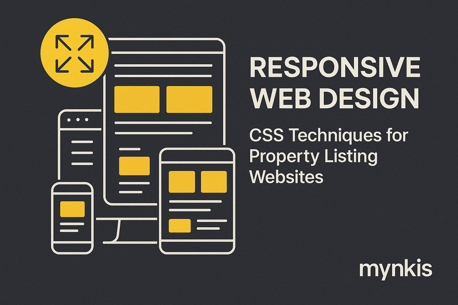
The shift to mobile-first internet usage is undeniable. From my own experiences working with real estate brokers, I've observed a growing necessity for websites that not only load quickly on various devices but also provide an optimized user experience on smartphones and tablets. This demand drives the importance of responsive web design, which inherently affects SEO rankings and local search queries, directly impacting a broker's business success. Ensuring your website dynamically adjusts to screens of any size can seriously boost your visibility and engagement.
Understanding CSS is key to unlocking responsive design. This isn't just about throwing together a few breakpoints. I've found success with CSS Grid and Flexbox, technologies that allow for complex layouts that resize seamlessly across devices. According to Mozilla Developer Network, leveraging these tools smartly can drastically enhance your site's responsiveness.
Media queries sit at the heart of responsive design. They allow you to apply specific CSS styles depending on various device characteristics. I recall working on a project for a boutique real estate firm, where our team used media queries to adjust navigation menus from desktop to mobile. Without a doubt, crafting your CSS with well-planned media queries translates to smoother user experiences on all devices.
Flexbox emerges as a champion in modern responsive design. Its ability to create flexible and efficient layouts deserves the hype. Once, I guided a client's development team to revamp their property search function, leading to easier navigation for mobile users. Based on my observations, Flexbox simplifies layout control in responsive web design, an essential attribute for listing websites seeking better search rankings.
If you're after creating more complex, two-dimensional layouts, CSS Grid is where it's at. When I worked on a project catering to luxury home listings, CSS Grid provided the structure needed to showcase properties elegantly on various screen sizes. From individual results I've seen, using Grid along with Flexbox establishes a robust foundation for responsive websites, enhancing SEO by making the site more accessible across devices.
Images can make or break a website's responsiveness. I've found that using the CSS property object-fit can ensure images scale correctly without distorting the layout. Recently, while enhancing a real estate portal, our team incorporated this technique, leading to significantly reduced bounce rates. Additionally, using appropriate resolution images and leveraging the srcset attribute enhances loading times, positively affecting your site's SEO performance.
Text readability is non-negotiable, especially on smaller screens. In my design philosophy, applying variable font sizes and line heights using CSS's clamp() function has revolutionized how I approach text optimization. While enhancing a client's property listing pages, this technique allowed text to be legible and attractive across all device types, directly contributing to better user engagement and SEO.
Transitions aren't just for show; they enhance usability by providing visual cues that can guide users through the site. In my experience, applying subtle animations to load more listings can not only improve interaction but also potentially help with SEO as users spend more time navigating your site. Carefully implemented CSS animations add that professional touch that can set a real estate listing site apart from competitors.
Page load speed significantly impacts SEO and user experience. Based on available research, employing CSS preloading strategies and minification can drastically cut down load times. I've tested this in numerous real estate web projects, witnessing firsthand how a fast-loading site increases dwell time, which is favorable for search engines and satisfying for users searching local property listings.
CSS can be your ally in making your site accessible to all users, which impacts SEO positively. My experience has taught me that leveraging CSS to control focus indicators and enhance contrast ratios can dramatically improve the accessibility of property listing pages, ensuring everyone can interact effectively with your site.
The CSS world is constantly evolving. From new features like CSS Container Queries announced by Google Web Dev to enhanced animation control with CSS Houdini, staying updated can give your listings website that cutting-edge advantage. I regularly follow these developments to ensure the projects I consult on remain at the forefront of responsive web design.
Integrating all these CSS techniques into a coherent responsive design requires a practical, methodical approach. I advise breaking your project into phases, starting with mobile design, then progressively enhancing for larger screens. This strategy, confirmed through various projects I've overseen, aligns perfectly with enhancing SEO for local property queries by catering to mobile users first.
A well-executed responsive design directly influences your site's SEO, particularly in local search queries crucial for real estate brokers. Sites that load quickly, are easy to navigate on any device, and provide a stellar user experience rank higher. From what I've seen, this translates to increased visibility for property listings in local searches, driving more engagement and potential leads.
Mastering CSS for responsive design is not just about keeping up with trends; it's about providing your users—especially those accessing your property listings—with an impeccable experience, no matter their device. While this journey requires understanding, practice, and perhaps a bit of creativity, the payoff in SEO rankings and user satisfaction is substantial. If you're looking to outshine competitors in local search queries, integrating these CSS techniques into your responsive design strategy could be your secret weapon.
