Schedule a Demo
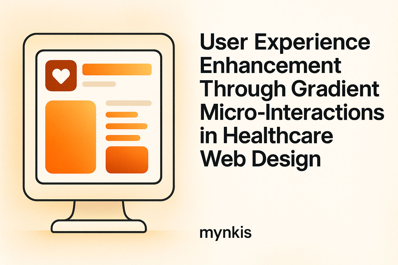
In my work with operations managers at clinics and hospitals, I've seen how vital user experience becomes when designing digital interfaces. Gradient colors and micro-interactions not only enhance visual appeal but can actually boost usability. These design elements, when used judiciously in patient portals and data management systems, help guide users through complex processes seamlessly. And, yeah, who doesn't love a bit of aesthetic beauty in their daily tech interactions, right?
Gradient colors trigger specific emotional responses in users. The transition from cool to warm hues can convey a sense of depth and motion within static interfaces. According to recent research by the Design Council, gradients can influence user engagement by up to 25%, depending on the color scheme. When designing secure medical software, understanding this aspect can significantly improve patient interaction. For patient portals, soft gradients often result in a more soothing experience, potentially alleviating concerns around accessing medical data online.
Micro-interactions are small animations or brief moments of interaction between the user and the system. These can range from button hover effects to subtle transitions when information updates. In healthcare, they matter because they signal action completion or alert users to necessary steps. For instance, a micro-interaction might gracefully guide a user's cursor to the next field in a patient form, thereby increasing fill rate efficiency. Or you might use a smooth 'shake' effect if a vital piece of information is missing.
Creating compliant and secure websites requires balancing design with stringent regulations. HIPAA compliance in the US, for instance, dictates how patient data can be presented and interacted with. Gradients can complement accessibility standards if the contrasts remain sufficient for users with visual impairments. Over at the World Wide Web Consortium (W3C), guidelines suggest specific color usage to ensure web content is accessible to everyone, providing a framework for navigating the rules effectively.
Think of gradients as an art piece that supplements your overall design strategy. They bring a sense of sophistication that elevates the overall experience. In my consultation with clinic administrators, I've recommended designing patient portals with subtle gradients to differentiate between sections, much like a canvas with thoughtfully placed hues drawing your attention exactly where it's meant to go. The trick is using gradients not for show but as functional signposts in patient data navigation.
The science behind micro-interactions lies in their cognitive influence. These minute responses can enhance the UX by providing immediate, gratifying feedback. Recent insights from Fast Company highlighted that well-designed micro-interactions cut down errors significantly in digital entry points. This is especially important for hospitals where timely and accurate entry of patient information can save lives. Consider micro-interactions a silent partner in data integrity and usability.
Implementing gradients and micro-interactions needs finesse. The gradient choice should align with the psychological response you're aiming to elicit. Blue gradients, known for their calming nature, could be perfect for psychiatric clinics. Meanwhile, micro-interactions must align with your function and not detract from it. Drawing from the guidance of Neil Patel's insights on UX, avoid overusing animations; like too much salt in a dish, excessive animations can spoil the user experience.
Incorporating user-centric design principles into medical data management systems can be transformative. Effective use of gradients can help distinguish important sections on a complex dashboard, making data retrieval more intuitive for busy healthcare professionals. Micro-interactions then further streamline this process. Just imagine logging into a secure data system where errors are minimized due to smart design cues - it's not just convenience, but operational efficiency at its best.
Take the case of General Hospital's patient portal overhaul. Their implementation of gradients made transitioning between patient records smoother, especially when performing shift changes. Mayo Clinic has used well-timed micro-interactions to confirm sensitive data entry securely, showing success in minimizing misinputs, as covered by the Journal of Healthcare Management. These institutions highlight what focused design can do to enhance operational flow in high-stress environments like healthcare.
The integration of gradient and micro-interactions isn't without its hurdles. From ensuring compliance to adapting these elements for different devices, design teams must tread carefully. Documentation from the Office of the National Coordinator for Health IT outlines best practices for responsive design, crucial when addressing patient needs across multiple devices. Balancing aesthetics and practical needs demands research, testing, and iteration to find the sweet spot that respects user requirements while ensuring that healthcare standards are met.
The future likely holds even more sophisticated uses of gradient colors and micro-interactions. As virtual and augmented reality become commonplace in healthcare, these design elements will play a crucial role. Predictions from experts at the Interaction Design Foundation suggest a rise in dynamic content that responds to user states. This trend could mean personalized gradients and micro-interactions tailored to individual patient emotions, offering a more personalized healthcare experience.
It's clear by now that technology can significantly elevate the design approach. High-fidelity prototyping tools like Figma allow clinics to mock up designs where you can actually tweak gradient settings and fine-tune micro-interactions in real-time. These tools enable iterative testing before going live, giving designers the freedom to innovate securely within the boundaries of medical standards.
Ultimately, gradients and micro-interactions aren't just about looking good. They serve as vital components of a user-focused approach to website design in healthcare. Enhancing usability while ensuring security and compliance elevates patient interactions with technology, resulting in seamless healthcare delivery. As professionals within the sector, embracing such design elements can foster environments where patients feel understood and cared for - and isn't that what we're all striving to achieve?